LinkedIn Banner Size in 2026: Dimensions, Safe Zones, and What to Put on It
The exact banner size for profiles and company pages, straight from LinkedIn's own specs, where your profile photo covers it, what survives the mobile crop, and the one line worth putting on it.

· 10 min read · Updated
On this page
Almost every banner that looks wrong on LinkedIn is a sizing problem. The image is sharp on the laptop it was made on, then it lands on a profile and the left third is behind a face, the top is cropped on a phone, and the tagline that was supposed to be the point is half gone.
This is the whole spec, what actually happens to the image on the page, and what to put on it once the dimensions are right.
LinkedIn banner size: personal profile and company page
LinkedIn calls the personal one a background photo in its own settings. Everyone else calls it a banner, a cover photo, or a header. It is the same image.
| Where | Size | Ratio | File types | Max size |
|---|---|---|---|---|
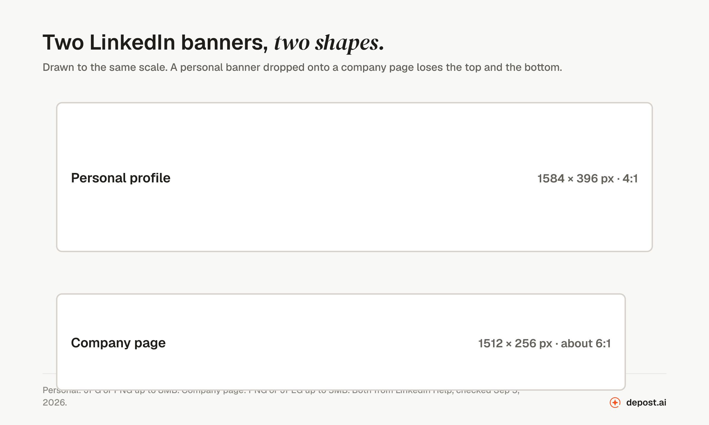
| Personal profile | 1584 × 396 px | 4:1 | PNG or JPG | 8MB |
| Company page | 1512 × 256 px | about 6:1 | PNG or JPEG | 3MB |
Both figures come from LinkedIn Help: the profile numbers from its photo upload requirements, the page numbers from its image specifications for Pages and Career Pages. Checked September 2026.
Two details from those pages that catch people out. LinkedIn does not accept GIFs for a profile photo or background photo, so an animated banner is not an option. And the two limits are different: 8MB on a personal profile, 3MB on a page, which matters if you are exporting a photograph rather than a flat design.
Upload at those dimensions or at an exact multiple of them. The free banner maker on this site exports the personal size at 2x, 3168 by 792, so it stays sharp on retina screens and LinkedIn scales it down cleanly. What you should not do is upload a wider image and let LinkedIn crop it, because you do not control where the crop lands.
The two shapes are not interchangeable. A 4:1 personal banner dropped onto a company page loses a slice from the top and the bottom, which is usually where the text was.
Every other LinkedIn image size
While you are in there, the rest of the specs LinkedIn publishes:
| Image | Size | Notes |
|---|---|---|
| Profile photo | 400 × 400 px | Anything from 400 × 400 up to 7680 × 4320 is accepted |
| Profile background photo | 1584 × 396 px | PNG or JPG, up to 8MB |
| Company page logo | 400 × 400 px | Minimum 268 × 268 |
| Company page cover | 1512 × 256 px | PNG or JPEG, up to 3MB |
| Life tab main image | 1128 × 376 px | Career Pages only |
| Link post preview | 1200 × 627 px | The 1.91:1 ratio LinkedIn recommends |
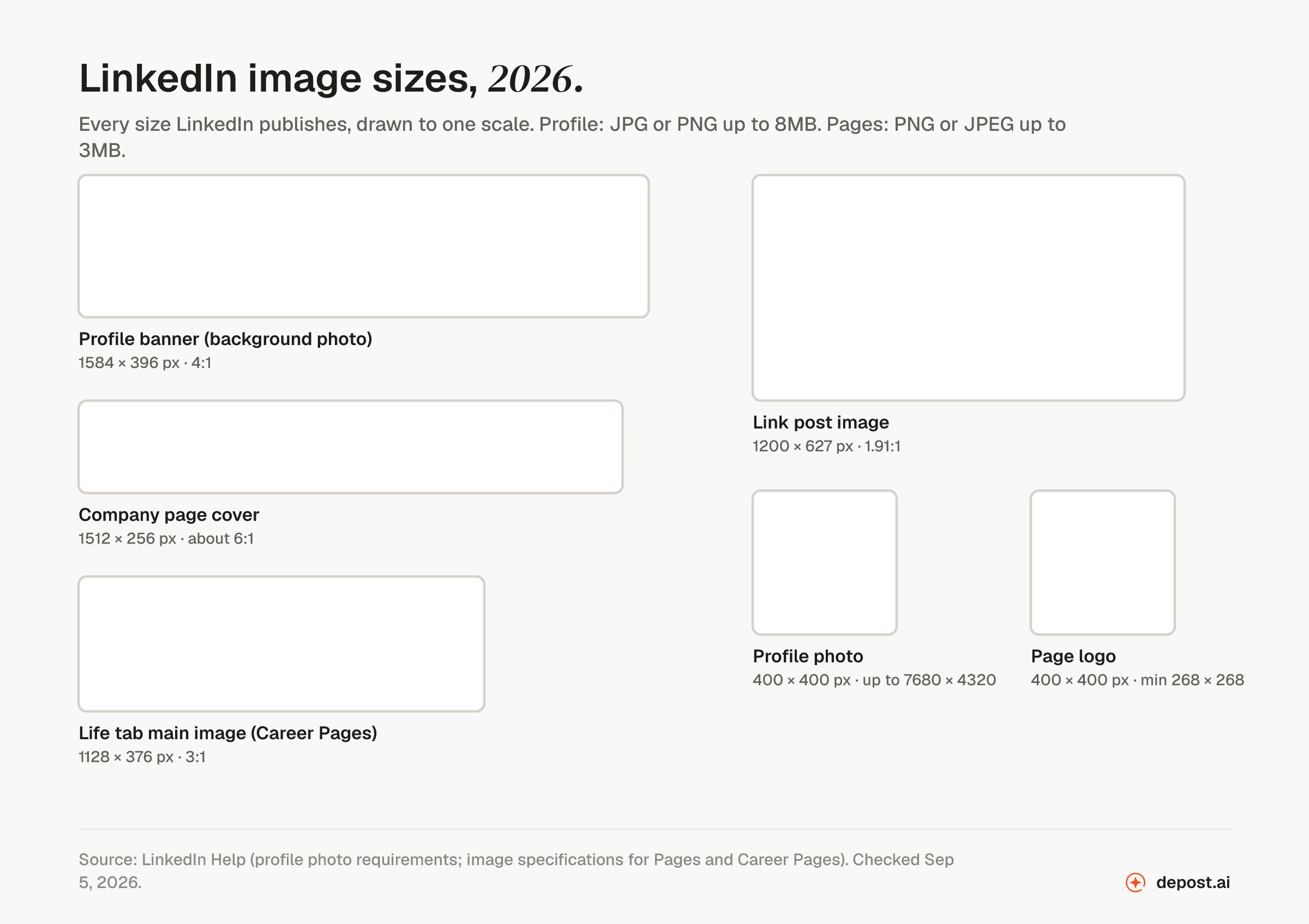
The link post size is the one people forget. When you share a URL, LinkedIn pulls the page’s own preview image, and if that image is not close to 1.91:1 it gets cropped in the feed. The link preview checker shows what LinkedIn will actually pull before you post.
Where your profile photo lands
On a personal profile, your photo sits over the lower-left of the banner. On desktop it overlaps the bottom-left corner; on mobile it sits a little further in and covers more of the height. Anything placed there is gone.
That rules out the bottom-left roughly a fifth of the width and the lower half of the height. The dependable space is the right two-thirds, in the vertical middle.
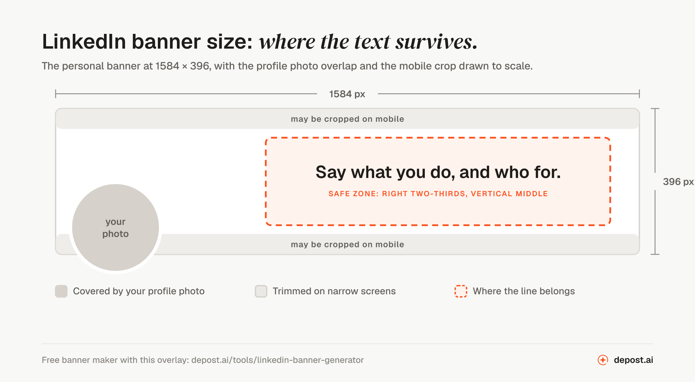
The banner maker draws that overlap on the preview, and you can put your actual photo inside it so you are judging the real overlap rather than a guess. It is a preview layer only; it never ends up in the download.
If the photo itself needs a fresh crop, the profile picture resizer frames it in the same circle LinkedIn uses and exports a square that uploads the first time. Lost the original file? The profile picture downloader gets the 400 × 400 copy back from one of your posts. To fit an image you already have to 1584 × 396, use the image resizer, and for post images the sizes are on the post image size page.
What survives the crop
The image is not shown at one size. It is scaled to whatever width the profile is being viewed at, and on narrow screens the top and bottom edges are trimmed to keep it from getting too tall.
Three rules follow from that:
- Keep the text in the vertical middle. The middle band survives every crop currently in circulation. The top and bottom edges do not.
- Keep it off the left edge. Between the photo and the mobile crop, the left fifth of the banner is the least reliable real estate on the profile.
- Make the type large. Fine detail and small text do not survive LinkedIn’s compression. If the line is not readable at a glance on a phone, it is not readable.
Flat colors and simple shapes compress well. Photographs with texture, gradients with many stops, and screenshots of anything do not. This is also why the file size limits rarely bite: a flat design at 3168 by 792 lands well under a megabyte, while a full-bleed photograph can run to several.
What to put on it
One line. The same job as your headline: what you do, and who for.
The banner is the largest text you get on LinkedIn, and most people spend it on a stock skyline, a sunset, or the default blue that has not been changed since the account was created. Someone who has just landed on your profile is deciding whether you are worth following, connecting with, or replying to. A line that states what you do gives them the context every other section then confirms. A skyline tells them you have not thought about it.
The banner and the headline are read within a second of each other, and they work when they rhyme: the banner makes the claim in large type, the headline restates it in searchable words. If you are settling both, write the headline first, with the headline generator if it helps, and put its plainest form on the banner. The profile checklist covers the rest of the sections in the same pass.
Five lines that work
The plain claim. “I help B2B founders turn LinkedIn into a pipeline.” Says what you do and who for. The safest default.
The claim with proof. “Grew from zero to 7,000 followers posting once a day. Now I help teams do the same.” One number, then the offer. Use a real number or none.
The topic. “Writing about pricing, positioning, and the SaaS metrics nobody explains.” For people whose profile is a publication rather than a service. It sets the expectation for the posts.
The offer. “Free LinkedIn audit for the first 20 people who message me this month.” For a campaign. Change it when the campaign ends, because a stale offer reads worse than no banner.
The credential. “Former Head of Growth at [company]. Now consulting.” For people whose past employer is the thing that earns the click. Short, because the About section will do the rest.
What all five have in common: a person could read them on a phone in the two seconds a profile visit lasts, and each one tells the visitor what to expect from the posts below.
The mistakes that cost the most
Text in the bottom-left. The most common one, because that is where a designer’s eye puts a caption. Your photo covers it.
Using the old company page size. 1128 by 191 is still the number in most guides and most template packs. Upload that to a page today and it is stretched to fill a 1512 by 256 slot, which softens every edge in it.
A collage. Four logos, a headshot, a phone number, and a QR code. None of it is readable at profile size, and it signals that the profile is an advertisement rather than a person.
Contact details. An email or a phone number on the banner cannot be clicked, and it dates the image the day either of them changes. The contact section exists for this.
A group photo. Faces at banner size are small and the crop moves them. If a face belongs on the banner, it is yours, and it is already there in the profile photo.
Leaving the default. Not a crime, but a missed slot. The banner is free positioning space at the top of the page, and the blue gradient tells people nothing.
Making it
Type your line into the LinkedIn banner maker, pick one of the eight designs, and download it at the exact size. Nothing is uploaded; the image is drawn in your browser. Add your profile photo to the preview to check the overlap, and use the corner handles to make the line as large as the space allows.
If you post on X as well, the Twitter banner maker is the same tool at X’s 1500 by 500, with the avatar corner marked for that platform instead.
If the banner should show your product rather than a line, put a screenshot of it on the banner with the screenshot background maker. It sizes the image to 1584 by 396 and keeps it in the right-hand part, clear of your photo.
The banner is a one-time job, and the profile is what people check after a post earned their attention. Its job is to confirm what the post suggested. If you are judging the posts as well as the profile, what a good engagement rate looks like in 2026 is the number to hold them against.
FAQ
What is the LinkedIn banner size in 2026?
1584 by 396 pixels for a personal profile, a 4:1 ratio, as a PNG or JPG up to 8MB. Company pages use 1512 by 256, as a PNG or JPEG up to 3MB. Both figures are from LinkedIn Help. Upload at those sizes or an exact multiple, and keep important text in the right two-thirds and the vertical middle.
Is the LinkedIn company page banner still 1128 by 191?
No. LinkedIn’s current image specifications for Pages list the cover image as 1512 by 256 pixels, with the same figure as both the minimum and the recommended size. 1128 by 191 is the older spec that most third-party guides are still repeating.
Is the LinkedIn banner the same as the background photo?
Yes. LinkedIn’s own settings call it the background photo. Banner, cover photo, and header are the same image; only the name changes.
Why does my banner look cut off on mobile?
The image is scaled to the screen width and trimmed at the top and bottom on narrow screens. Text placed near the edges is the first thing to go. Keep the line in the vertical middle and it survives the crop.
Can I use a GIF as my LinkedIn banner?
No. LinkedIn’s photo requirements accept PNG and JPG for the profile photo and background photo, and state that GIFs are not supported. An animated banner is not possible on a personal profile.
Can I use a photo as my LinkedIn banner?
You can, if it compresses well and the text stays readable over it. Textured or busy photos lose detail under LinkedIn’s compression, and the crop moves whatever the photo’s subject is. A flat color with a clear line outworks most photos at profile size.
Should the banner and the headline say the same thing?
Nearly. The banner makes the claim in large type; the headline restates it in the words people search for. When the two disagree, the profile reads as unfinished.