What Is a Good LinkedIn Engagement Rate in 2026? Benchmarks by Format
The 2026 benchmarks by format, the three formulas behind them, why two different rates for the same post can both be right, and what actually moves the number.

· 9 min read · Updated
On this page
Two people can look at the same LinkedIn post and report engagement rates ten times apart. Neither of them is wrong, and neither of them usually says which formula they used.
That is why published benchmarks for 2026 range from under 1% to above 5% depending on where you read them, and why so many people conclude their account is failing when it is doing fine. Here are the three formulas in circulation, the current numbers by format, and what actually moves yours.
Three formulas, three different answers
Engagement rate is the share of people who did something with a post beyond seeing it. The disagreement is entirely about what counts and what you divide by.
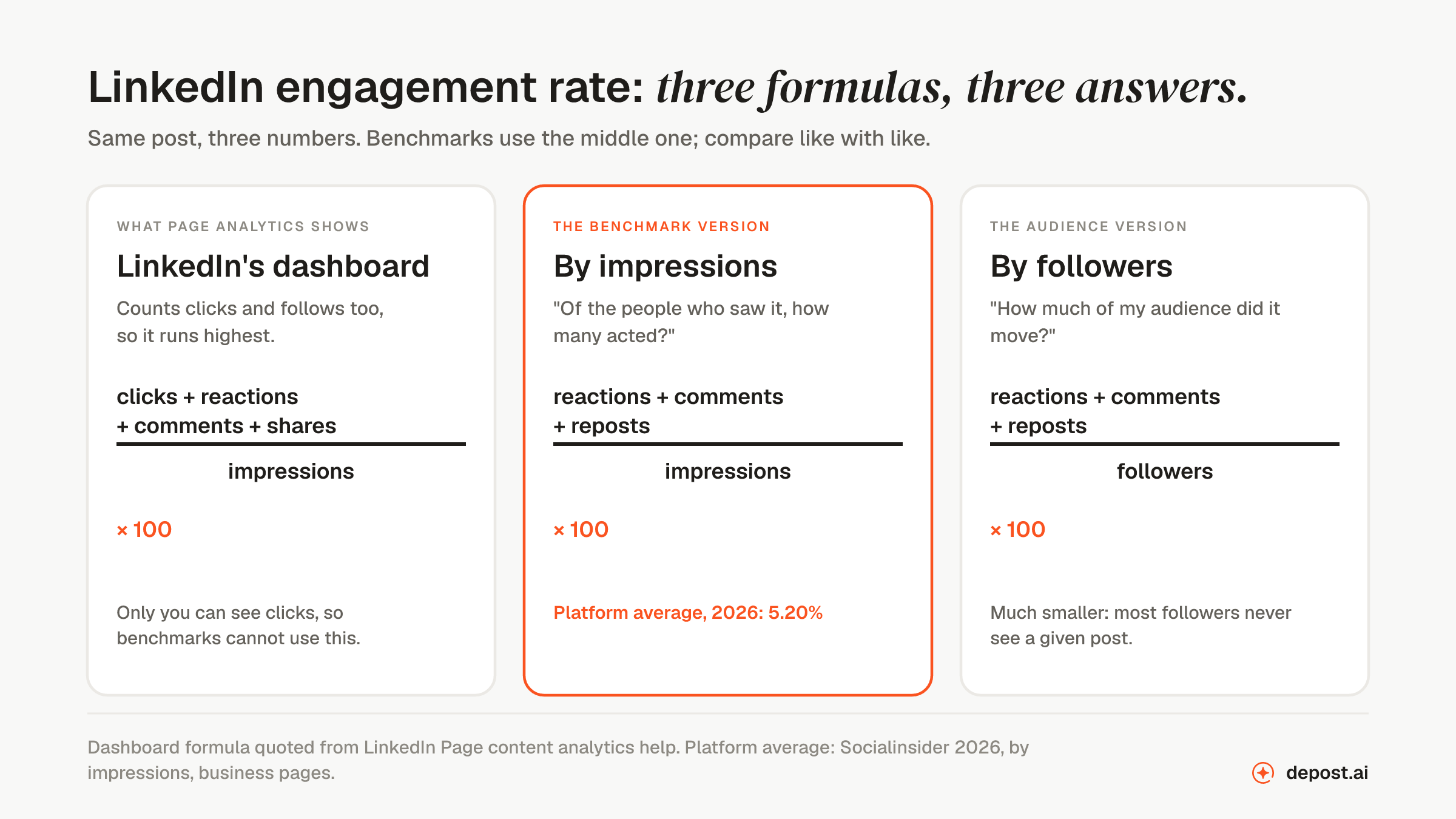
LinkedIn’s own dashboard runs highest. Its help pages define the engagement rate in Page content analytics as the ratio of interactions to impressions, where interactions include clicks, reactions, comments, and shares. Clicks are the important word: a “see more” expand or a profile click counts, and nobody outside your account can see those. That is why no benchmark uses this version, and why the number LinkedIn shows you is usually the flattering one.
By impressions is the benchmark version:
(reactions + comments + reposts) ÷ impressions × 100
It answers “of the people who saw this, how many acted?”, and it is the formula behind almost every published figure, including the ones below.
By followers is the same numerator divided by your follower count. It answers a different question, “how much of my audience did this post move?”, and it produces a much smaller number, because most of your followers never see any given post.
None of the three is wrong. The mistake is comparing one against a benchmark built from another. If a tool tells you your rate is 0.4% and a chart says the average is 5.20%, check the denominators before you conclude anything. The engagement rate calculator gives you both of the comparable versions, benchmarked, so you can see which one you were looking at.
The 2026 benchmarks by format
Socialinsider’s current edition analyzed 1.3 million posts across 16,645 business pages. These are its Q2 2026 figures, by impressions.
| Format | Engagement rate |
|---|---|
| Multi-image posts | 6.90% |
| Documents (carousels) | 6.60% |
| Video | 5.90% |
| Single image | 5.20% |
| Polls | 4.50% |
| Text only | 3.95% |
| Posts with a link | 3.30% |
| Platform average, all formats | 5.20% |
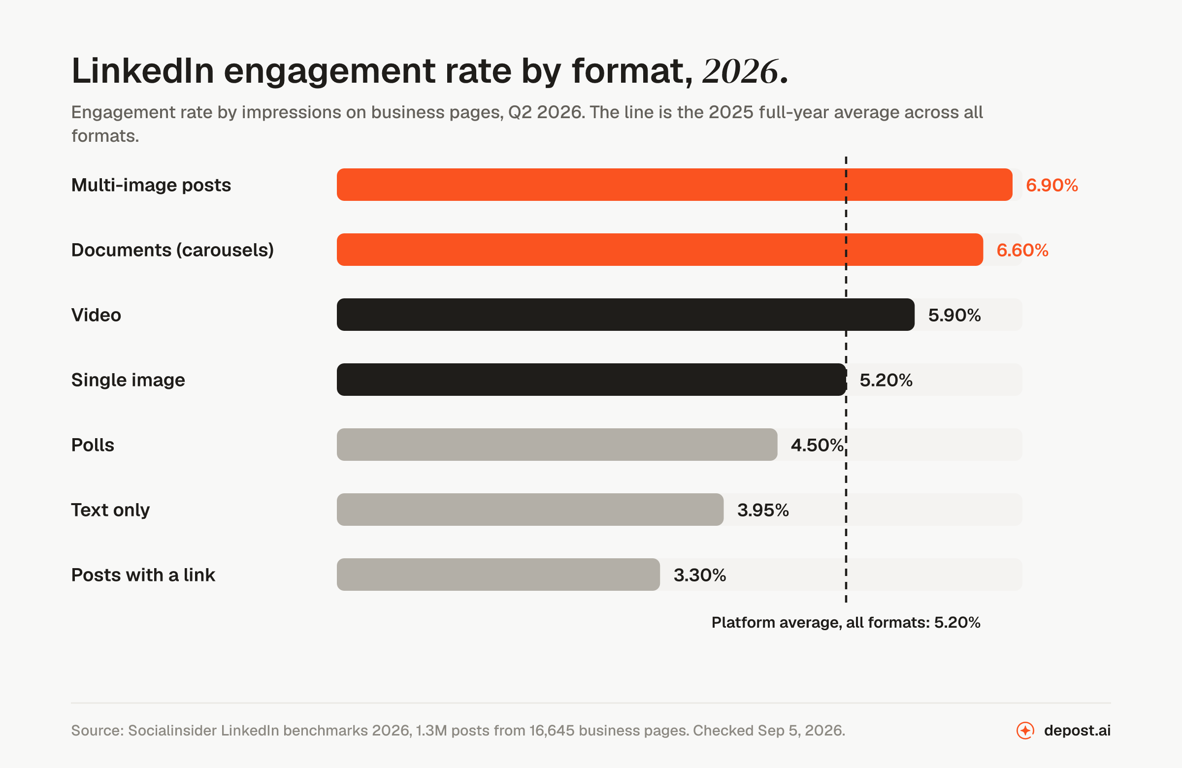
Three things are worth reading out of that table.
The spread between the best and worst format is nearly two to one. A document post and a link post can carry identical writing and land a long way apart, which makes format the cheapest lever on this page. Carousels hold attention across slides, and that dwell time is read as interest.
Links sit at the bottom, and they always have. This is not a penalty so much as an exit: a post whose job is to send people elsewhere gets fewer of the actions that count as engagement. If the link matters, the usual fix is to make the post work on its own and put the URL in the first comment or the post body once the argument has landed.
Text-only posts at 3.95% are below average, which surprises people who write well. It is not a verdict on writing. It is a verdict on the format’s ceiling, and it is why a good text post that would have done 4% often does better rebuilt as a carousel.
Why the benchmark sets disagree
Search for this number and you will find 5.20%, 3.85%, 2.1%, and figures under 1%, all published this year. They are not contradicting each other. They are measuring different things.
Different denominators. Company page benchmarks are usually computed by impressions, because page owners can see them. Personal profile benchmarks are usually computed by followers, because a researcher studying creator accounts can only see what is public. Divide by followers instead of impressions and the same post’s rate falls roughly tenfold.
Different account types. Socialinsider’s 5.20% is a business page average. Personal profiles behave differently, and generally better: personal profiles earn about 8× the engagement of company pages, while company page organic reach has fallen around 60% since 2024.
Different account sizes. A niche consultant with two thousand followers who all know her will run far above any platform average on a normal week. A page with fifty thousand followers will run far below it, and that is arithmetic, not failure. Reach grows faster than the number of people who care.
So before you use any benchmark, ask three questions of it: by impressions or by followers, pages or profiles, and what year. A figure from three years ago is not a benchmark, it is history.
What counts, and what counts more
The formula treats a reaction, a comment, and a repost as one action each. The LinkedIn algorithm does not, and since LinkedIn rebuilt its ranking system in March 2026 there is published detail on how it weighs them.
A comment is worth more than a reaction because it costs the reader more, and a comment you reply to is worth more still, since it signals a conversation rather than a broadcast. Time spent on the post is also read as interest, which is why formats that hold attention are favored in distribution, and why the two image-heavy formats sit at the top of the table above.
So a post with fifty reactions and two comments and a post with twenty reactions and thirty comments can show similar engagement rates and be treated very differently by the system. When you look at your own numbers, look at the mix, not just the total. The comment-heavy post is the one to learn from.
What actually moves the number
The hook. The feed shows about three lines before it collapses the rest behind “see more”. The click on that link is the first engagement a post earns, and posts that do not earn it do not earn anything else. If your rate is low across the board, the first line is the first place to look. The hook generator writes five alternatives from a draft, each taking a different angle.
The format. Two to one, per the table above. If you have a post with more than three points in it, it is probably a carousel. The carousel maker builds one from plain text.
The first hour. Distribution is a staged test. A post goes to a slice of your network first, and if that group responds, it is shown to more people. Being present after publishing to reply to comments while the post is still being tested is the single cheapest thing you can do for the rate, and most people are in a meeting when it matters. Scheduling for a time you can be present beats posting at the “perfect” time you cannot, which is the practical conclusion of finding your own best time to post.
Consistency of subject. The system is classifying you as well as the post. An account that keeps writing about one thing teaches it exactly who to run the first test on, and those readers are the ones most likely to respond. An account that changes subject every week resets that audience each time.
Asking for the action you want. A question at the end of a post earns comments. “Agree?” earns reactions. A post that ends with a statement earns whatever it earns. None of this is manipulation; it is telling the reader what kind of response you would find useful.
What a good rate looks like for you
The platform average is a floor to clear, not a target to hit. The number to beat is your own.
Take your last twenty posts, work out the rate by impressions for each, and find your median. Use the median rather than the mean, because one post that travels unusually far will drag an average upward and make every normal post look like a failure against it.
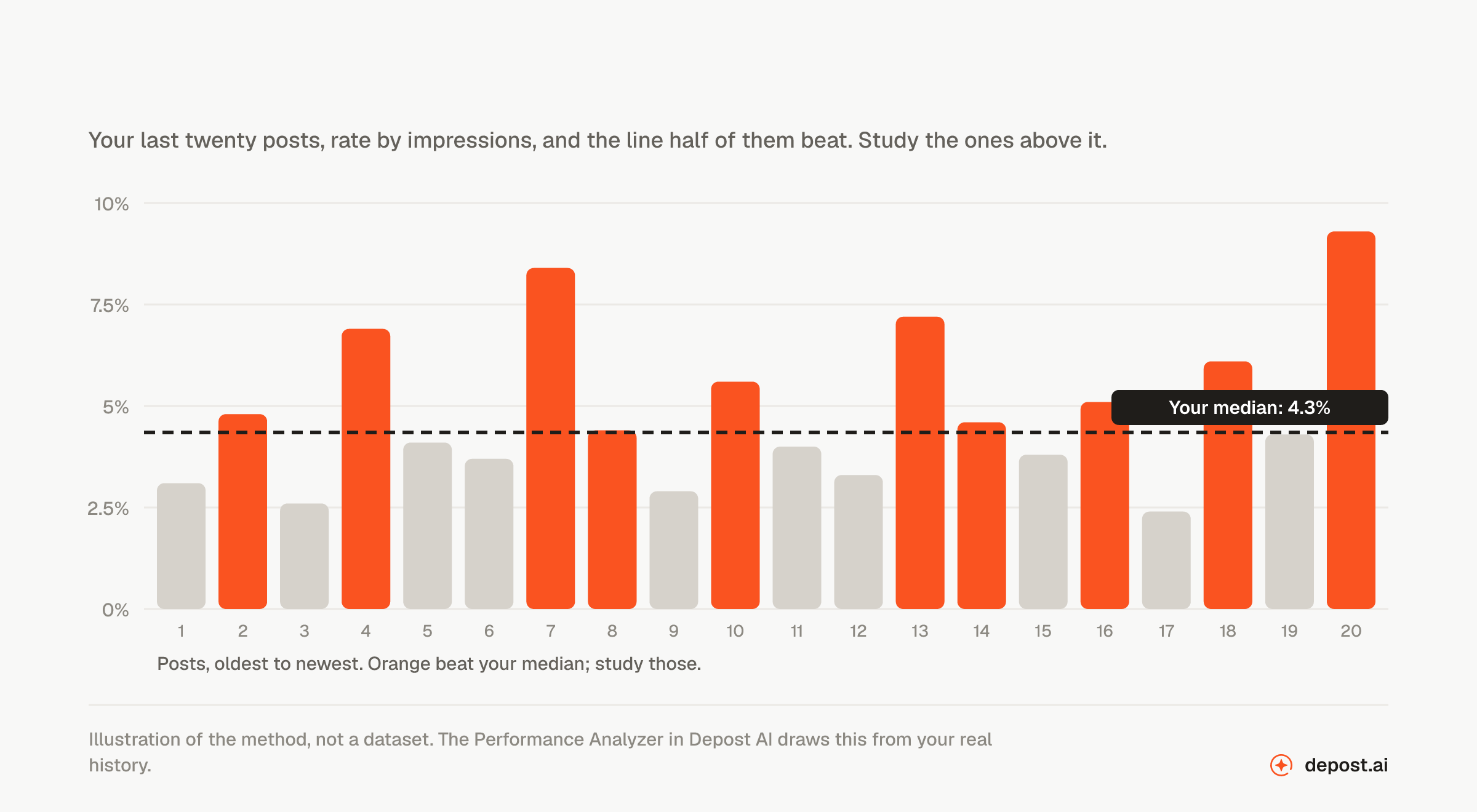
That baseline says more about your audience than any benchmark, because it is measured on exactly the people you care about. From there, the question changes from “am I above average?” to “which of my posts beat my average, and what did they have in common?”
That second question is the one worth answering, and it usually has a clear answer within a month of looking. The hooks that worked, the formats that held people, the subjects your readers actually turn up for. Write more of those.
The benchmark tells you where the platform is. Your own history tells you where to go.
FAQ
What is a good engagement rate on LinkedIn?
Above the 2026 platform average of 5.20% by impressions is good. Document posts, the carousel format, average 6.60% and multi-image posts 6.90%, so a strong visual post should clear a higher bar than a text one. Above 8% on a text post is exceptional. Compare against your own median before you compare against the platform.
How do I calculate LinkedIn engagement rate?
Add reactions, comments, and reposts, divide by impressions, and multiply by 100. That is the version the benchmarks use. Dividing by followers instead gives a much smaller number that answers a different question, and LinkedIn’s own dashboard adds clicks to the numerator, which makes its figure higher than either.
Is a 2% engagement rate on LinkedIn bad?
By impressions, it is below the platform average and worth looking into, starting with the hook and the format. By followers, 2% would be excellent, because most followers never see any given post. Check which one you have before you act on it.
Why is my company page engagement so low?
Because company pages earn a fraction of what personal profiles do, about an eighth on average, and their organic reach has dropped roughly 60% since 2024. It is the platform, not the page. If reach matters, the people at the company need to post.
Which LinkedIn format gets the most engagement?
Multi-image posts at 6.90% and document posts, the carousel format, at 6.60% lead the 2026 benchmarks, both well clear of the 5.20% average. Posts with an external link are last at 3.30%.
Why does my rate fall as my post reaches more people?
Because the denominator grows faster than the interactions do. A post that escapes your immediate network reaches colder readers who engage less, so a falling rate on rising reach is usually a post doing well, not badly. Read the rate next to impressions rather than on its own.
Does engagement rate matter more than followers?
For anything you want to happen, yes. A thousand followers who respond will get you a conversation; fifty thousand who scroll past will not. Growth follows engagement, rarely the other way round.