How to Make a LinkedIn Carousel Post, Start to Finish
The design step is why most people skip carousels. Two free tools cover the writing and the design, LinkedIn turns the PDF into slides, and the whole thing takes about twenty minutes.

· 10 min read · Updated
On this page
- What a LinkedIn carousel actually is
- Step 1: Write the slides before you design anything
- Step 2: Design the slides without a design tool
- Step 3: Export, then check slide one on a phone
- Step 4: Write the caption
- Step 5: Post it
- What goes on each slide
- Why carousels are worth the extra step
- When the free generator is not enough
- What kills a carousel
- The numbers worth watching
- FAQ
Carousels are the format most people skip, and it is never the writing that stops them. It is the design: a text box nudged two pixels left at eleven at night, ten slides that have to look like each other, and an export that comes out blurry.
None of that is necessary anymore. Write the slides, let a generator lay them out, download the PDF, and post it. About twenty minutes, and no design tool.
What a LinkedIn carousel actually is
There is no “carousel” button on LinkedIn. What everyone calls a carousel is a document post: you upload a file, and LinkedIn turns each page into a slide people swipe through in the feed.
That matters because it tells you what the constraints really are, and there are fewer of them than most guides suggest.
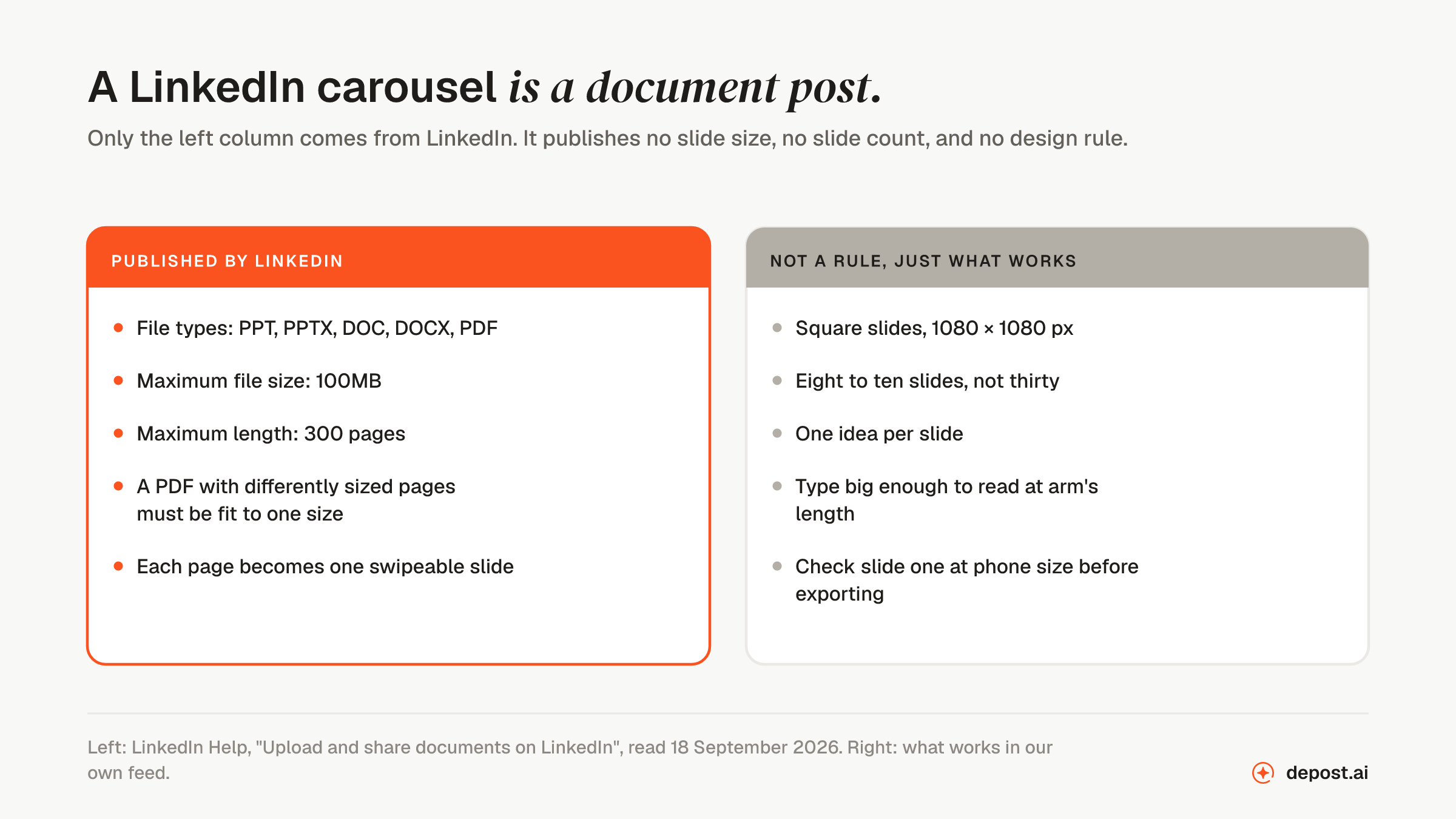
Two things follow. A square PDF works at whatever size your tool exports, as long as every page is the same size, so there is no official dimension to hunt for. And 300 pages is not an invitation: the limit that matters is how many slides somebody will actually swipe through, which is closer to ten.
If you want the sizes LinkedIn does publish, for banners, profile photos, and link images, they are in LinkedIn banner size in 2026.
Step 1: Write the slides before you design anything
The most common mistake is opening a design tool first. You end up with a beautiful deck that says nothing, because the layout decided the content.
Write the slides as plain text. One idea per slide, a heading and a line or two under it, nothing longer than about 35 words. If a slide needs two sentences to make its point, it is two slides.
If the blank page is the problem, the free carousel content generator takes rough material, who it is for, and what you want the carousel to do, and returns eight slides of copy built for that shape. No account, and what you type is sent once to generate the result and not stored.
Feed it something real. “How we run customer interviews that actually change the roadmap. 30 minutes, 5 questions, no feature talk allowed. We did 40 of these last year and killed two planned features because of what we heard” produces a usable deck. “Customer interviews” produces a generic one.
Step 2: Design the slides without a design tool
Paste the slides into the LinkedIn carousel generator, one box per slide, with the first line as the heading and the rest as the body.
Then make three choices, and only three:
- A style. Clean, Editorial, Bold, Frame, or Minimal. Judge them on your own cover text rather than the sample, since that is the slide that has to work.
- A palette. Twelve of them, or a custom color if you have a brand hex.
- A heading font. Sans, Serif, Rounded, Marker, Script, Poster, CAPS, or Mono.
Add an author line, which appears on every slide, and a photo or logo beside it. Slides come out at 1080 by 1080. Nothing is dragged into place unless you want it to be: you can click a heading or body to select it and move it, but the default layout is already sized for the feed.
Step 3: Export, then check slide one on a phone
Download the PDF, which is the format LinkedIn’s document option wants. PNGs are there too if you want the same slides for somewhere else.
Then do the one check that separates a carousel that looks professional from one that does not: look at slide one at phone size. LinkedIn compresses uploads, and small type that was crisp on your laptop comes out soft on a phone held at arm’s length. If the cover heading is hard to read, cut words rather than shrinking type.
Step 4: Write the caption
A carousel with no caption is a deck nobody has a reason to open. The caption is where the swipe gets sold.
Say what the deck contains and who it is for, in two or three lines. Do not summarize all ten slides, because then there is no reason to swipe. The hook generator is useful if the opening line is not landing, and the text formatter keeps line breaks intact through LinkedIn’s editor.
Write your first comment at the same time. It is free space directly under the post, and most people leave it empty.
Step 5: Post it
LinkedIn’s own steps, from its “Upload and share documents on LinkedIn” help page:
- Click Start a post in the box at the top of your homepage
- Click More, then the Add a document icon
- Click Choose file and pick your PDF
- Add a title to the document and click Done
- Add the caption
- Click Post
The title you give the document is shown with the slides in the feed, so it is worth more than “carousel-final-v3”. Treat it as a second headline.
What goes on each slide
Structure is most of what makes a carousel work. This is the shape that holds up.
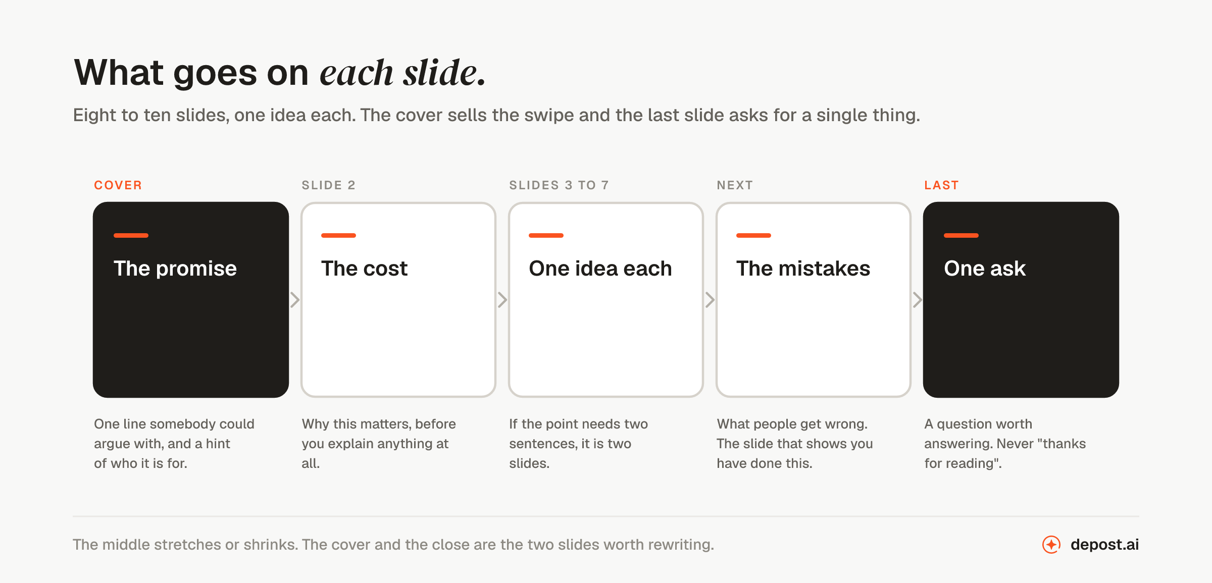
The cover is the whole post. If it does not earn a swipe, the other nine slides do not exist. What works is a claim somebody could disagree with, a question that names a problem the reader has, or a specific result. What does not work is a title. “Customer interviews” is a title. “Most customer interviews are too polite to be useful” is a cover.
Slide two says why it matters. Name the cost of getting it wrong and the reader decides the rest is worth their time.
The middle slides carry one idea each, in order. Order is doing real work here: if slide five only makes sense after slide six, people drop out at five and you never see why.
The mistakes slide is the one that shows you have actually done the thing rather than read about it. It is also the easiest slide in the deck to write, because you have made them.
The last slide asks for exactly one thing. A question worth answering beats a link, and both beat “thanks for reading”, which wastes the slide where people are most willing to act.
Why carousels are worth the extra step
Carousels average a 6.6% engagement rate against 5.9% for video and 3.95% for text-only posts, and carry 39% more reach than the average LinkedIn post (Socialinsider and industry benchmarks, 2026). The full by-format table is in what a good LinkedIn engagement rate looks like in 2026.
The mechanism is not mysterious. Every swipe is a small decision to keep going, and sustained attention on a post, known as dwell time, is a signal LinkedIn reads as the post being worth showing to more people.
Two other things carousels do that a text post cannot:
- They hold a sequence. A process, a comparison, a thing that changed over time: each stage gets its own frame instead of a paragraph.
- They get saved. A deck people want to keep is a deck they come back to, although LinkedIn’s saved posts list makes coming back harder than the save implies.
When the free generator is not enough
The free generator covers the common case: text slides, consistent styling, out the door in minutes. It makes one carousel at a time, in a style you pick each time.
The step after that is a deck in your own brand without choosing anything. Depost AI learns your colors and type from what you have already published, designs the graphic in the same chat as the post, and the two arrive together for approval. A photo, a chart, or an illustration on a specific slide is a job for a canvas, and the time it costs is the reason most people never made the carousel in the first place.
If you want to study decks that already work, the carousel downloader pulls a published carousel down so you can look at how it was built, slide by slide.
What kills a carousel
- Paragraphs on a slide. Unreadable on a phone, which is where most people will see it.
- A cover that describes instead of promising. The most common failure and the most fixable.
- Inconsistent styling. Changing fonts or colors mid-deck reads as running out of time.
- Too many slides. The longer the deck, the fewer people reach the end, and reaching the end is the number that matters.
- A weak close. One ask, not four.
- No caption. The deck cannot do the persuading alone.
The numbers worth watching
Likes are the least useful signal available to you. Three are better:
- Completion rate, how many people reach the last slide. The only number that tells you whether the structure held.
- Saves, the strongest indication that something was genuinely useful.
- Comment quality. Three real questions beat forty replies saying “great post”.
A carousel with 40 likes and two serious inbound messages beats one with 900 likes and none.
FAQ
What size should a LinkedIn carousel be?
LinkedIn does not publish a slide size. Square slides at 1080 by 1080 pixels are the convention, because square occupies more vertical space in the feed than landscape. What LinkedIn does require is that every page in the PDF is the same size.
How many slides should a LinkedIn carousel have?
Eight to ten. LinkedIn allows up to 300 pages, but the number that matters is how many people reach the last slide, and that gets harder the longer the deck runs. Each slide should carry one idea.
What file types does LinkedIn accept for a carousel?
PPT, PPTX, DOC, DOCX, and PDF, up to 100MB. PDF is the safest, because it is the format that preserves your layout exactly as you exported it.
How do I post a carousel on LinkedIn?
Click Start a post, click More, then the Add a document icon, choose your PDF, give the document a title, add your caption, and post. The document title is displayed above the slides, so write it as a second headline.
Can I make a LinkedIn carousel with AI?
Yes, for the writing and the layout, which are the two slow parts. The free carousel content generator drafts the slide copy from your rough material, and the free carousel generator lays it out and exports the PDF. The judgment about what is worth saying is still yours.
Do I need Canva or Figma to make a carousel?
No. The free carousel generator lays out text slides with consistent styling and exports the PDF, and Depost AI designs the deck in your own brand alongside the post. A canvas is only worth opening when a specific slide needs photography or a chart.
Why does my carousel text look blurry on LinkedIn?
LinkedIn compresses uploads. Small type survives that badly, so the fix is fewer words in larger type rather than a higher-resolution export. Check the cover at phone size before you post.
What topics work best as carousels?
Anything with a sequence: steps, a breakdown of something that went wrong, a comparison, a framework. Opinions and short stories usually do better as text posts, where the argument arrives in one piece.