LinkedIn carousel generator
Carousels are LinkedIn's highest-engagement format, and making one should not require a design subscription. Type your slides below, one box per slide with the first line as the heading, then pick a style: Clean, Editorial, Bold, Frame, or Minimal, in any of twelve palettes and eight heading fonts, with your photo or logo on every slide. Download a PDF ready for the composer's document option, with type sized to survive LinkedIn's compression and a phone held at arm's length.
1080 × 1080 per slide · click a heading or body to select it, drag to move · PDF for LinkedIn, PNGs for anywhere else
The slides
First line is the heading, the rest is the body
Style
Palette
Heading font
Why it matters
The format the feed pays best.
Every swipe extends the time a reader spends with your post, and attention held is what the feed pays reach for. Carousels are the one format where the reader does that work slide by slide, which is why they lead every engagement benchmark.
6.6%
average engagement on carousel posts, the platform’s highest-performing format.
Benchmarks, 2026
5.20%
the average LinkedIn engagement rate across all formats in 2026. Carousels sit well above it.
Socialinsider, 2026
≈3×
the engagement of video posts, and about 6× text-only posts.
Industry data, 2026
Not our numbers. Socialinsider’s and 2026 benchmarks’.
Beyond this one graphic
Made one by hand. The agents make one per post.
Inside Depost AI, the AI content team B2B founders and teams run on LinkedIn, every drafted post arrives with its graphic already designed in your brand style. The agents plan from your analytics, write in your voice, design the visual, and schedule through the official API. You approve, it publishes.
The swipe is the unit of attention
A carousel is not a post with pages; it is a sequence of decisions. The cover competes in the feed like any post, which is why it gets the largest type and a promise worth the first swipe. Every slide after it is re-earning the next one, and the slides that kill carousels are the ones that exist to set up their successor: a reader who hits a slide with nothing on it assumes the rest match and leaves. One idea per slide, worded so it would survive alone as a quote, is the whole discipline, and the auto-fitting type here enforces it mechanically: a slide that shrinks is a slide that is doing two slides’ work.
The payoff metric for carousels is the save. People save reference material, and a format walkthrough, a checklist, or a ranked list is reference material by construction. Build for the reader who will want this again next month, and the algorithmic rewards follow from that reader’s behavior.
Pick the style for the job
The style is a claim about what kind of deck this is, so match it to the material. Clean is for how-tos and frameworks, the workhorse look that puts all the attention on the words. Editorial, with its hairline rules and oversized numbers, is built for ranked lists and countdowns, where the number is half the story. Bold opens on a full accent cover that reads as a headline from three feet away; use it when the deck is an opinion or an announcement and the cover has to pick a fight. Frame centers each idea inside a bordered card, which suits principles, rules, and anything you want screenshotted one slide at a time. Minimal strips everything back to the sentence and a row of progress dots, and it is the right choice when the writing is doing story work.
Whatever you pick, pick once. A deck that keeps one style, one palette, and one heading face across ten slides reads as designed; the same slides restyled at random read as assembled. The same holds across posts: the second carousel that looks like the first is the beginning of a recognizable format, and recognizable formats are what people follow for. Your photo or logo on every slide finishes the job, because carousels travel as screenshots, and a screenshot of slide six should still say who made it.
Write the slides first, then dress them
If you are starting from a rough idea rather than finished slide copy, run it through the carousel content generator on this site first: it turns one paragraph of material into eight slides in exactly the heading-plus-body shape this editor expects, so the handoff is a paste per slide. Then write the post that will carry the document as its own piece, because the post text is what the feed algorithm reads; the hook generator earns its keep there. And if what you are really making is something to give away rather than something to scroll, that is the lead magnet generator’s job: a carousel earns the audience, a lead magnet converts it.
Questions
- How do I post a carousel on LinkedIn?
- A LinkedIn carousel is a PDF shared as a document post: in the composer, choose the document option and upload the file this tool gives you. Each PDF page becomes one swipeable slide. That is the entire mechanism, which is why the download here is a PDF and not a zip of images.
- What do the five styles change?
- The whole layout system, applied to every slide at once. Clean is the working default: left-aligned, an accent rule, the classic how-to look. Editorial adds hairline rules and an oversized slide number, the magazine treatment for ranked lists. Bold opens on a full accent-color cover and runs a numbered chip through the deck, built for opinions and announcements. Frame centers everything inside a bordered card with corner marks, which suits principles and quotes. Minimal is whitespace, one accent dot, and progress dots, for decks that read like a story. Same slides, five different decks, one click apart.
- Can I put my photo or logo on the slides?
- Yes. Upload one image and it appears circle-cropped beside your author line on every slide, which is what makes a swiped screenshot of slide six still attributable to you. The image never leaves your browser; it is drawn onto the canvas locally like everything else.
- What size are the slides?
- Square, 1080 by 1080, rendered at double resolution before the PDF is assembled. Square is the shape that uses the most feed space on both desktop and phone without cropping. If you need the slides individually, the PNGs button downloads every slide as its own image at the same quality.
- Why is the type so large?
- Because LinkedIn compresses documents and phones are small. A carousel is read at arm's length at swipe speed, and text that looks generous in an editor reads as fine print in the feed. The type auto-fits downward for longer slides, and when you see it shrink, that is the slide telling you it carries too many words.
- How do the slides work in the editor?
- One box per slide: the first line becomes the heading, everything after it becomes the body. That convention matches the carousel content generator on this site, so its output pastes straight in, slide by slide. The cover gets the biggest type and a swipe cue; every other slide gets its number.
- How many slides should a carousel have?
- As many as it has ideas, usually five to ten. Completion falls as length grows, and an unfinished carousel earns neither the save nor the follow. The tool caps at twelve; if your material wants more, it is probably two carousels or an article.
- Is there a watermark, and is anything uploaded?
- No and no. The slides are drawn in your browser, the PDF is assembled in your browser, and your photo or logo is read locally and never sent anywhere. The download carries nothing but your carousel.
From the blog
All posts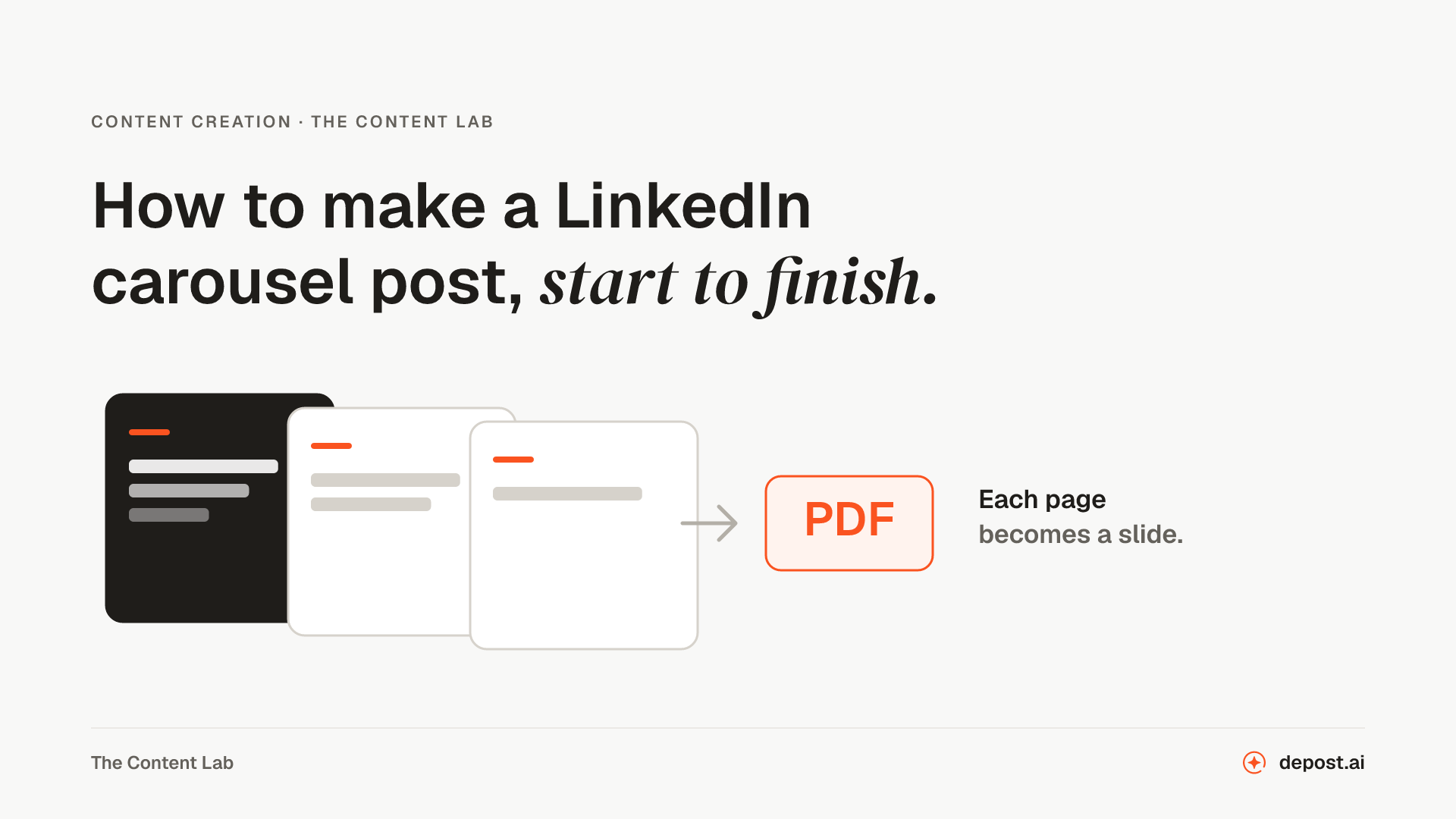 Content CreationHow to Make a LinkedIn Carousel Post, Start to FinishThe design step is why most people skip carousels. Two free tools cover the writing and the design, LinkedIn turns the PDF into slides, and the whole thing takes about twenty minutes.
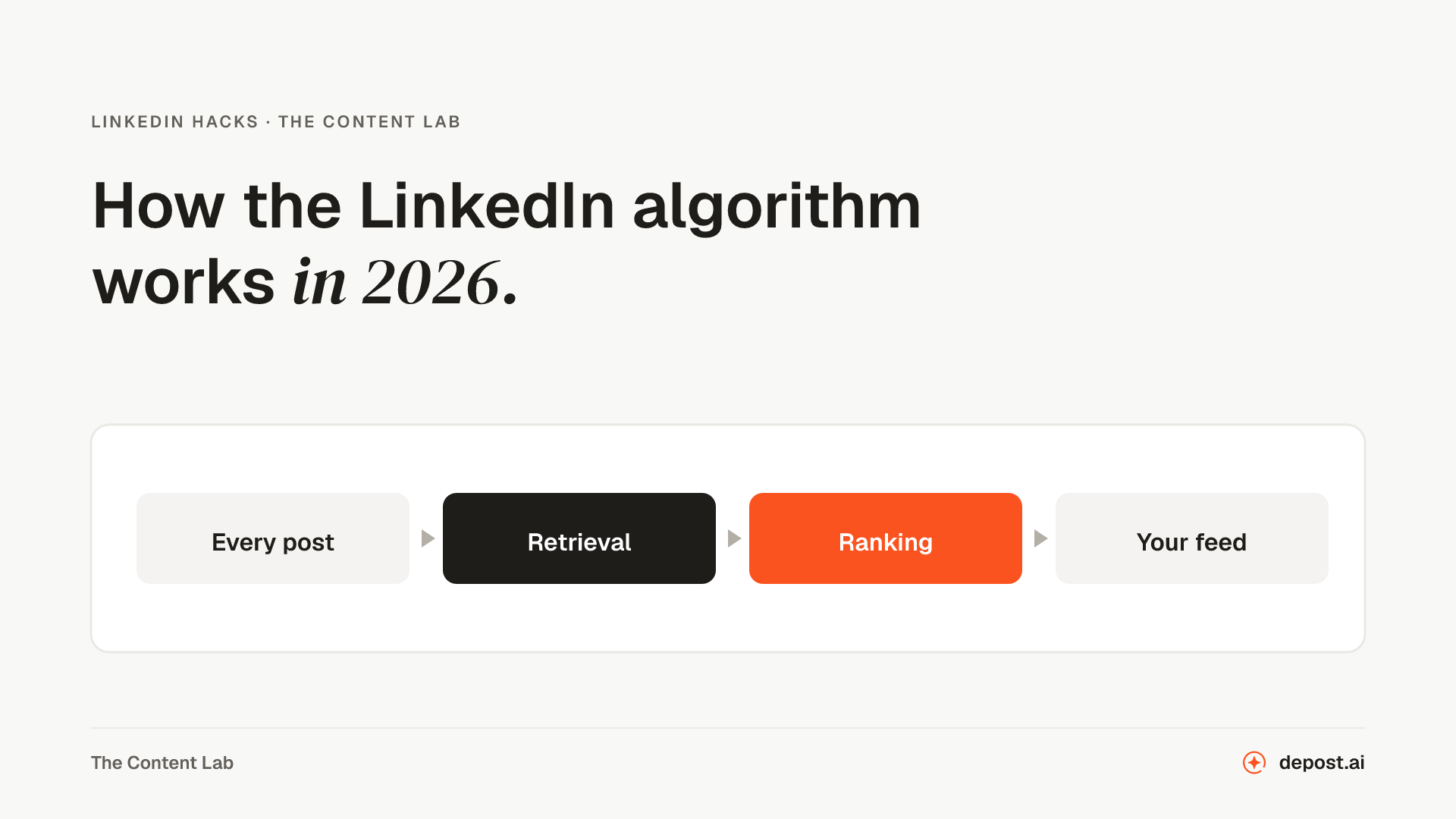 LinkedIn GuidesHow the LinkedIn Algorithm Works in 2026LinkedIn rebuilt feed ranking in March 2026 and published how it works. Here is what the company confirmed, what third parties measured, and what is still guesswork.
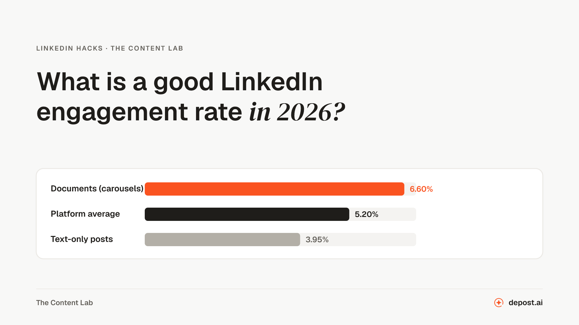 LinkedIn GuidesWhat Is a Good LinkedIn Engagement Rate in 2026? Benchmarks by FormatThe 2026 benchmarks by format, the three formulas behind them, why two different rates for the same post can both be right, and what actually moves the number.
Next
LinkedIn Carousel Content Generator
Slide-by-slide copy for a carousel: a cover that earns the first swipe, one idea per slide, and a last slide that asks for something.
LinkedIn Carousel Tester
Drop in your carousel PDF and click through it inside a LinkedIn post at desktop and phone width, with checks for file size, pages, page size, layers, and the smallest text.
LinkedIn Post Image Size
Every LinkedIn image size in pixels, each with the LinkedIn page it comes from, and a checker that measures your own image against them.
Make LinkedIn your
best-performing channel.
Brief your team once. It studies, plans, writes, designs, and schedules. You approve.
Your brief comes with you: once you're set up, it's the team's first job.
7 days free · Strategy in your first 15 minutes · Cancel anytime