LinkedIn Dwell Time: What It Is and Why It Is Not in Your Analytics
LinkedIn measures how long you stop on a post, says so in its own engineering papers, and shows you none of it. Here is the real definition, what your analytics does report, and the closest stand-in you can compute.

· 21 min read
On this page
Dwell time is the most quoted LinkedIn metric that nobody has ever seen.
Search for it and you are offered benchmarks. Aim for this many seconds. The average is that many. Posts above the line get reach. None of those numbers come from LinkedIn, and one of the most widely repeated quotes about them is not in the document everyone attributes it to.
LinkedIn has published a real definition, twice, in its own engineering writing. It names dwell as something its ranking model predicts. It also gives you no way to see it. This post is the record. What dwell time is in LinkedIn’s own words. Every metric your analytics actually reports. Where the invented numbers come from. And the closest thing a writer can measure instead, tested on 12,736 posts.
What dwell time is, in LinkedIn’s own words
The definition, from 2020. LinkedIn’s engineering team published “Understanding feed dwell time” on 12 May 2020, written by Siddharth Dangi, Johnson Jia, Manas Somaiya and Ying Xuan. It describes two measures. The first is dwell time “on the feed, which starts measuring when at least half of a feed update is visible as a member scrolls through their feed”. The second is dwell time “after the click, which is the time spent on content after clicking on an update in the feed”.
So the clock starts at half the post on screen. Not at a click, not at a reaction. Scrolling slowly past your post is already being counted.
Why LinkedIn built it. The same post gives the reason in plain terms: “Click and viral actions can be rare, especially for passive consumers of the feed. While these members may still visit the feed frequently and find value in the updates they see, they may shy away from taking click and viral actions.”
That is the whole argument. Reactions and comments only see the people who act. Most people do not act. LinkedIn wanted a signal for the rest.
LinkedIn’s own comparison. The post sets the two kinds of signal side by side in a table. Against click and viral actions, dwell time is “Always measurable” rather than “Not always measurable”, a “Real-valued measure of engagement” rather than a “Binary indicator”, and where clicks are a “Noisy indicator of engagement”, dwell “Can be a more reliable indicator of engagement”. Clicks have “Positive signals are rather sparse”; dwell has “No shortage of signals”.
Remember that last line. Every post you publish generates dwell data from everyone who scrolled past it. Almost none of them generate anything you can see.
The opposite of dwell is a skip. The 2020 work modelled skipping, treating “updates viewed for less than Tskip seconds as having been skipped by the member”. LinkedIn never published what Tskip is. The gain it reports is a model accuracy figure, “consistently increasing the area under the ROC curve of the model by as much as 10%”, which is about the prediction, not about anyone’s reach.
Dwell is still in the ranking, and LinkedIn names it
LiRank, 2024. LinkedIn’s ranking paper LiRank, presented at the KDD conference in August 2024, lists what the feed model predicts: “like, comment, share, vote, and long dwell and click for each member, candidate post pair. These predictions are linearly combined to generate the final post score.”
The paper explains why that target was added: “We introduced a long dwell signal to detect passive content consumption on the LinkedIn Feed. Implementing this signal effectively, allows the capture of passive but positive engagement.”
What “long dwell” means, and why no second count exists. LiRank defines it as “a long dwell binary classifier predicting whether there is more time spent on a post than a specific percentile (e.g., 90th percentile)”. The threshold is not one number: “Specific percentiles are determined based on contextual features such as ranking position, content type, and platform.”
LinkedIn’s February 2026 ranking paper repeats the same shape: “Long Dwell: dwelling on a post longer than a specified threshold of time, depending on the post-type.” Alongside it sits the other target, “Contribution: a like, comment, or share on a post”.
The threshold is not even a fixed number inside LinkedIn. A second engineering post, published 1 October 2024 by Fengyu Zhang, Mohit Kothari and Birjodh Singh Tiwana, spells out how the bar is set. It describes “a binary classifier that predicts whether a user will allocate more time to a post compared to a specific percentage (x%) of its counterparts”, with the percentile calculated “for each unique combination” of “content type, creator type, and distribution method”. Then the line that settles the question: “This entire process is performed on a daily basis, ensuring that the percentiles remain dynamic rather than static.”
The same post gives the clearest reason dwell exists at all: “Dwell time is crucial for evaluating the relevance and engagement of out-of-network content, where interactions are less common.”
Read that twice. The bar moves with the kind of post, the kind of creator, how the post reached you, and what day it is. There is no number of seconds to aim for, because LinkedIn does not use one. Any page telling you to hold a reader for a particular count of seconds is inventing the rule it is quoting.
It is still there in 2026. LinkedIn’s March 2026 write-up of the rebuilt feed, by Hristo Danchev, lists what the system learns from: “your actions (long dwells, likes, comments, shares) are embedded and interleaved with post representations”. Long dwells come first in that list.
And LinkedIn tells members, in plain language. Its help page on how the feed decides what to show names the signals it uses. One of them is “Content you spend the most time viewing”. Another is “What the post is about and whether it provides knowledge or advice”.
Why it is not in your analytics
Here is everything LinkedIn gives a creator. The help page that defines post analytics names every metric you get:
- Who saw it: impressions, members reached, the in-network and out-of-network split.
- What they did: reactions, comments, reposts, saves, sends, visits to links in the post, premium button interactions.
- What it did for you: profile viewers from the post, followers gained from the post.
- Video only: video views, watch time, average watch time.
- Articles and newsletters: article views, email sends, email open rate.
Three of those are time measures, and all three sit under video. “Watch time: The cumulative length of time your video was viewed.” “Average watch time: The average amount of time that your video was watched.”
So the only clock you get is for video. LinkedIn’s own developer documentation says the same thing in harder terms: the watch-time metric is “only available for posts that contain a video”. Write a text post, an image post or a carousel and there is no duration number anywhere. Not in the app, not in the export, not in the API.
Newsletters do not get read time either. The newsletter analytics page lists article views, new subscribers, impressions, engagements and demographics. No read time, no completion rate.
Why LinkedIn keeps it. A visible dwell number would be a target, and LinkedIn has been through exactly that before. In February 2024 its editor in chief Dan Roth explained why the platform dropped another reading signal: “As soon as we realized what people were doing, and that we had incorrectly attributed the ‘read more’ button as a signal that people were getting some value out of a post, we just stopped using that as a signal.”
The see-more click was a proxy for reading. People wrote posts designed to earn the click. LinkedIn stopped counting it. A published dwell score would go the same way within a month.
Where the numbers on the first page come from
Search for a dwell-time benchmark and the same pair of figures comes back: posts held for 61 seconds or more get a 15.6% engagement rate, posts dropped in under three seconds get 1.2%. It is a satisfying number. It is on page after page. We went looking for the study behind it.
There is no study. The figures come from a table on one page, published on 21 July 2025 on the blog of a digital marketing and web development agency, under the byline “Mainuser”. The table has five rows, from “0-3 seconds” at “1.2%” up to “61+ seconds” at “15.6%”, each with a verdict attached. Underneath it the page says “The data above paints a clear picture”.
The page names no study, no dataset and no sample. It carries no outbound link to any other website at all. Its own domain no longer resolves, so the only way to read it now is in a web archive. Two paragraphs after the table it contradicts it, saying “a good dwell time on LinkedIn is generally considered to be around 2-5 seconds or more”. A sister page on the same site, published the same morning, gives a third target of “at least 10-15 seconds for posts and 30-60 seconds for articles and videos”.
The same page also states, flatly: “Yes, you can access your dwell time metrics in LinkedIn Analytics.” That is not a feature LinkedIn has ever offered. It then explains that LinkedIn calculates dwell using “scroll depth, time spent reading, and engagement metrics like likes and comments”, none of which appears in LinkedIn’s definition.
Now watch the number travel. The same two figures, with five incompatible stories about where they came from:
| Page | Date | What it credits |
|---|---|---|
| A LinkedIn automation vendor | Dec 2025 | A footnote to the page above, the only honest link in the set |
| An agency blog | Jul 2026 | “Richard van der Blom’s Algorithm Insights Report” |
| A LinkedIn tool | Jun 2026 | “2026 Algorithm Research” |
| A LinkedIn tool | Aug 2026 | “Third-party analyses of the 2026 feed” |
| A preview tool | Oct 2026 | Nothing at all |
Only the top and bottom rows of the original table survive the journey. The middle three, 3.5% and 6.1% and 10.2%, get dropped, which is how an unsourced table turns into a dramatic fifteen-fold gap.
One quote in that chain was manufactured. The vendor page that cites the origin correctly also runs a pull-quote: “Dwell time is a more reliable indicator of engagement”, attributed to Siddharth Dangi, Senior Staff Software Engineer at LinkedIn. He is a real co-author of the 2020 post. He never wrote that sentence. The source is the comparison table quoted above, whose cell reads “Can be a more reliable indicator of engagement”. A table cell was rewritten into a sentence, given a speaker and given a job title.
The real dwell numbers are about ads. There is one set of traceable figures, and they are not about your posts. AJ Wilcox of B2Linked, who runs LinkedIn advertising, published LinkedIn’s ad benchmarks in July 2024. Newsfeed ads averaged about 2.68 seconds. The LinkedIn Audience Network averaged 17.5 seconds, connected TV 23.55, single image ads 4.76. Those are averages for paid placements, measured by a system advertisers can actually see. Strip the word “ads” out and they read like targets for your organic posts, which is roughly how this whole category of advice came to exist.
Some pages get it right, and deserve saying so. A handful of tool blogs state plainly that LinkedIn has never published the number, that the threshold is relative to post type and position, and that dwell appears nowhere in your analytics. They are correct, and they are outnumbered.
What you can measure instead
You cannot see how long anyone stayed. You can see what they did when they got to the end.
A reaction is one tap, often from the feed, often without opening the post. A comment is different. Somebody read enough to have an opinion and then typed it. So the share of a post’s engagement that is comments, rather than reactions, is the closest thing a writer can compute to a reading signal.
It is a proxy and a weak one, and the limits are at the end of this post. But it is measurable, and it says something the engagement count does not.
Our library: 13,336 posts published between 9 July and 6 October 2026. For the ratio to mean anything a post needs at least ten reactions, and a writer needs at least six such posts. That leaves 12,736 posts by 358 creators. Each post’s comments-per-100-reactions is divided by the same writer’s own typical ratio. The same own-median method as our test of what works on LinkedIn.
Reach and reading are not the same axis
Split each writer’s own posts into thirds by how many reactions they drew, then look at what the comments did.
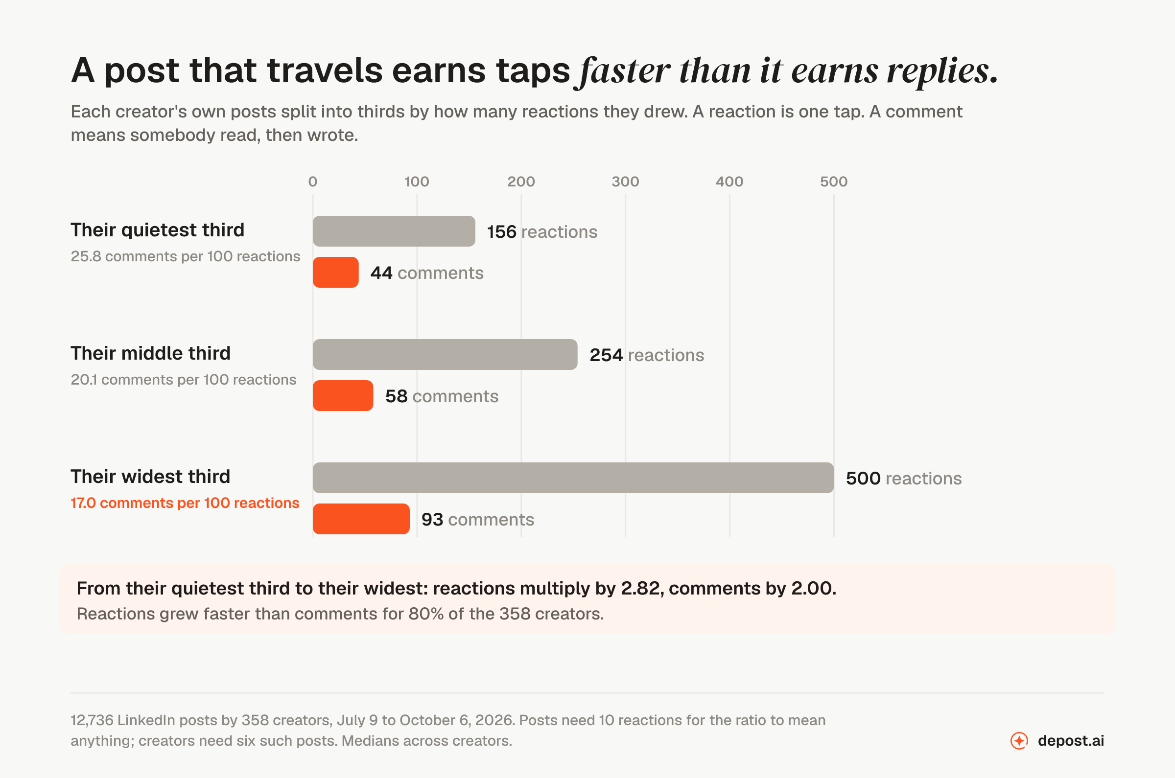
| The writer’s own posts | Reactions | Comments | Comments per 100 reactions |
|---|---|---|---|
| Their quietest third | 156 | 44 | 25.8 |
| Their middle third | 254 | 58 | 20.1 |
| Their widest third | 500 | 93 | 17.0 |
Per creator, the widest third multiplies reactions by 2.82 against their quietest third, and comments by only 2.00. Reactions grew faster than comments for 80% of the 358 creators.
This is measured on the two counts separately, so it is not an artefact of dividing one by the other. When a post travels, it collects taps faster than it collects replies. The extra audience is a wider, cooler audience.
That is worth holding onto, because it means a post that reaches more people is not automatically a post that was read by more people. The two numbers come apart, and you can only see one of them.
A short post buys taps, a long post buys replies
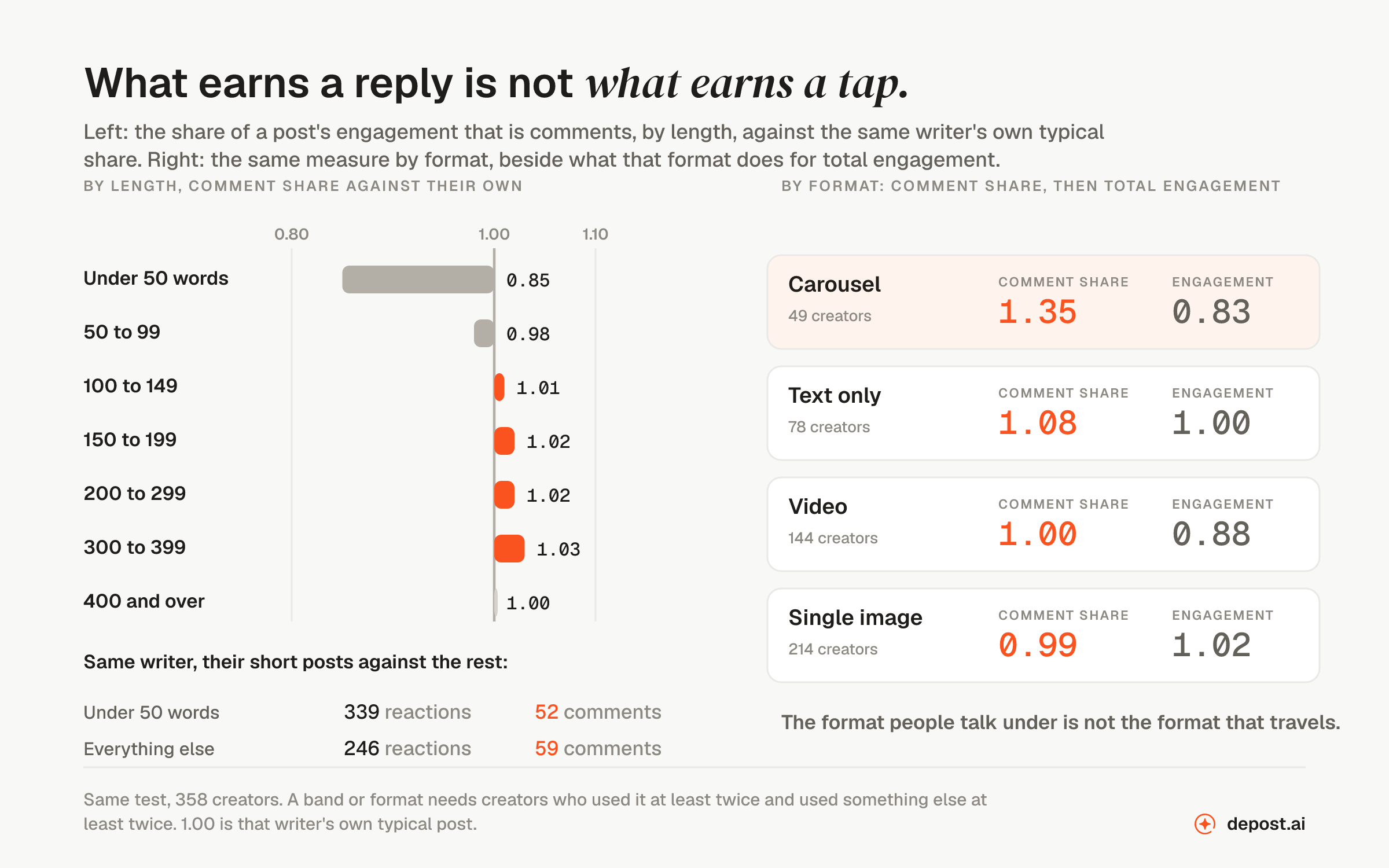
Take the 147 creators who wrote both short posts and long ones. Their posts under 50 words drew a median of 339 reactions and 52 comments. Everything else they wrote drew 246 reactions and 59 comments.
| The same writers | Reactions | Comments |
|---|---|---|
| Their posts under 50 words | 339 | 52 |
| Everything else they wrote | 246 | 59 |
Fewer people saw the long ones, or at least fewer tapped. More people wrote back.
By length band, against each writer’s own comment share:
| Length | Comment share | Writers it worked for |
|---|---|---|
| Under 50 words | 0.85 | 25% of 147 |
| 50 to 99 words | 0.98 | 43% of 182 |
| 100 to 149 words | 1.01 | 55% of 232 |
| 150 to 199 words | 1.02 | 52% of 258 |
| 200 to 299 words | 1.02 | 58% of 273 |
| 300 to 399 words | 1.03 | 56% of 185 |
| 400 words and over | 1.00 | 47% of 107 |
The very short post is the only one that clearly loses on this measure. Everything from 100 words up is level. Total engagement, meanwhile, is flat across every band, which is what our post on length found on the full set.
The format people talk under is not the format that travels
| Format | Comment share | Total engagement | Creators |
|---|---|---|---|
| Carousel | 1.35 | 0.83 | 49 |
| Text only | 1.08 | 1.00 | 78 |
| Video | 1.00 | 0.88 | 144 |
| Single image | 0.99 | 1.02 | 214 |
A carousel earns a third more comments per reaction than the same writer’s typical post. Of the writers who used one, 76% beat their own comment share. It also earns less total engagement than their typical post. The single image is the exact mirror: most reach, fewest comments per reaction, and only 34% of its writers beat their own comment share with it.
If dwell time behaves the way LinkedIn describes, the carousel is the format that should earn it, because a swipe is a decision to stay. We cannot confirm that from outside. What we can say is that the carousel is the format people stop to argue with, and the single image is the one that travels.
The shapes, and one that surprised me
The same split by what the post was doing. The shapes with the highest comment share are the ones that ask for something or take a side. The question post scores 1.33 across 15 creators. The offer scores 1.14 across 44. The founder’s lesson scores 1.11, and 88% of the 16 creators who wrote one beat their own share with it.
The shapes at the bottom are the ones that win everything else. Leadership thoughts score 0.91 on comment share and 1.18 on total engagement. The vulnerable moment: 0.94 and 1.18. The career before-and-after: 0.95 and 1.21.
The posts people respect are not the posts people reply to. Both are worth writing, for different reasons, and no single number in your analytics separates them.
On my own account
I can do one thing with my own posts that I cannot do with the library: put the response beside the audience, because LinkedIn tells me my impressions.
Across 49 posts with impressions recorded, from 16 July to 15 October 2026: 58,746 impressions, 1,901 reactions, 1,196 comments and 143 reposts.
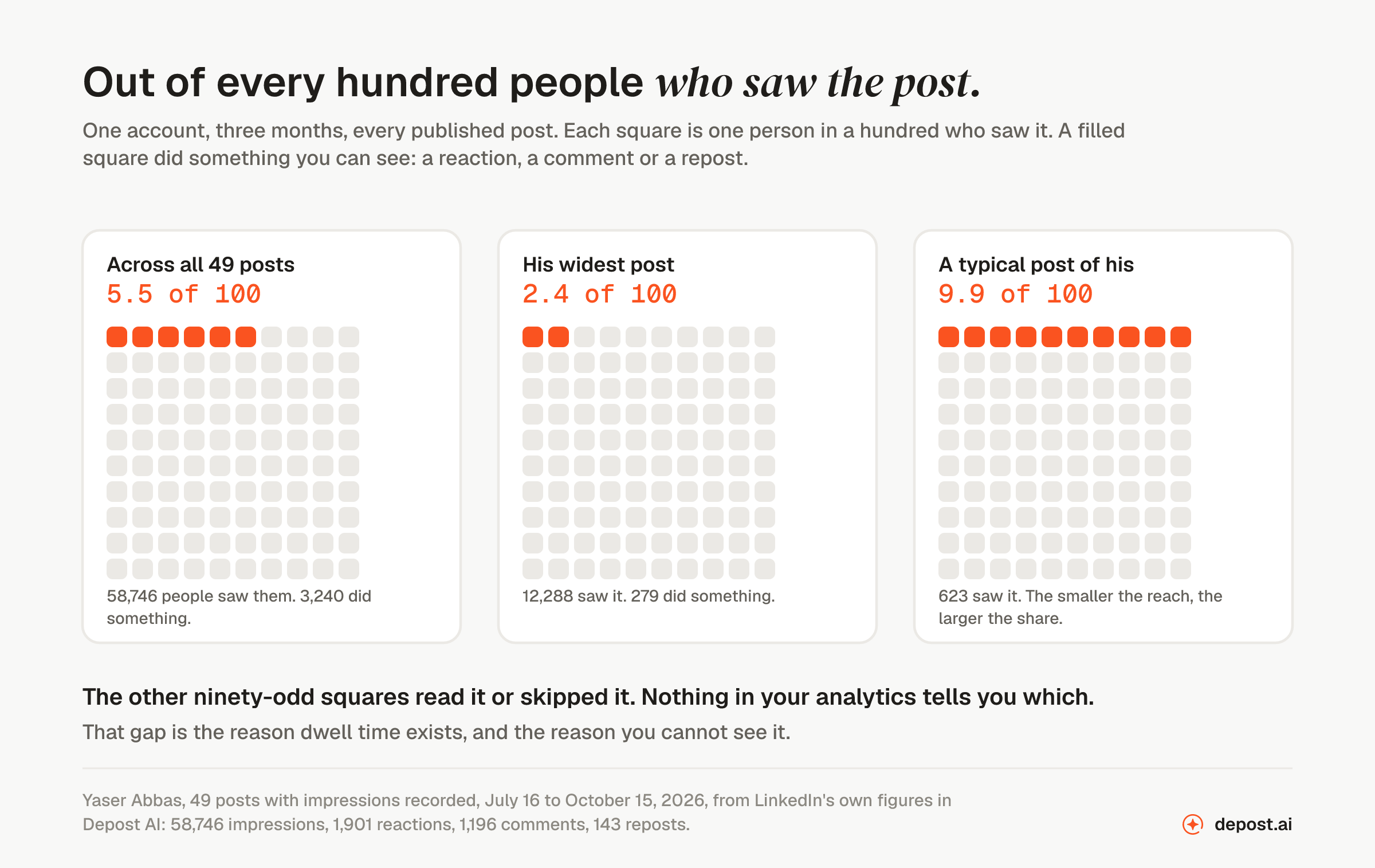
That is 5.5 actions of any kind for every 100 impressions. Reaction, comment, repost, all of it together. About 94 people in every 100 saw the post and left nothing behind.
And the pattern from the library shows up here too, from the other direction. My widest post of the quarter reached 12,288 people and drew 279 actions, which is 2.4 per 100. A typical post of mine reached 623 people and drew 9.9 per 100. The further a post travelled, the smaller the share of its audience did anything.
My own comment share is far higher than the library’s, because I have run posts that ask for a comment. That makes my absolute numbers useless for comparison. The trend inside my own account is the part that holds.
So what do you do about it
Stop looking for the dwell number. It is not in the product, it is not in the API, and the threshold is not a fixed quantity even inside LinkedIn. Any benchmark you are given for it was made up by the person giving it to you.
Use watch time if you post video. It is the one real attention metric LinkedIn hands a creator, and almost nobody opens it.
Write the first two lines for the person who has not decided yet. The clock starts at half the post on screen, which means the opening is being measured whether or not anybody clicks. This is the one piece of practical advice that follows directly from LinkedIn’s own definition rather than from a vendor’s guess.
Watch comments per reaction on your own account, over twenty posts or more. Not as a score. As a second axis. If a post reached fewer people but drew proportionally more replies, it did something the reach number cannot show you. If you sell to the people who read you, that is probably the post you wanted.
Do not chase it with tricks. The see-more click was a reading proxy once, people gamed it, and LinkedIn dropped it. There is no reason to expect a different ending this time.
What this test cannot tell you
A comment is still a trace. Everybody who read a post properly and then moved on is invisible in our test, exactly as they are in your analytics. That is precisely the gap dwell time was built to fill, and our proxy cannot fill it either. We are measuring the visible minority and inferring about the rest, which is the thing this post criticises other pages for doing. The difference is that we are telling you.
The library is not a cross-section of LinkedIn. These are creators whose posts perform, with a median of 294 reactions a post. A typical LinkedIn member’s post does not look like this. The within-writer comparisons hold anyway, because each writer is compared with themselves, but the absolute numbers are not benchmarks.
Comment share can be bought. Any writer can raise it by asking for comments, as my own account shows. That is a reason to watch your own trend and not to compare your number against anybody else’s.
Our shape labels are automatic. Post shapes and formats are classified by a model, not by hand, so individual posts are sometimes filed in the wrong place. The bands with few creators, like the question post at 15, move easily.
None of this measures dwell. It measures response. LinkedIn is the only party that can see how long you held someone, and the evidence is that it intends to keep it that way.
FAQ
What is dwell time on LinkedIn?
Dwell time is how long a member spends on a post. LinkedIn’s engineering team defined it in 2020 as two measures: time on the feed, which “starts measuring when at least half of a feed update is visible as a member scrolls through their feed”, and time after the click, which is “the time spent on content after clicking on an update in the feed”.
Is dwell time a ranking factor on LinkedIn?
Yes, and LinkedIn names it. Its 2024 ranking paper LiRank lists the things the feed model predicts as “like, comment, share, vote, and long dwell and click”, combined into a single post score. Its February 2026 ranking paper names “Long Dwell” as one of two headline prediction targets. LinkedIn’s member-facing help page lists “Content you spend the most time viewing” among the signals that shape your feed.
Can I see dwell time in LinkedIn analytics?
No. No LinkedIn screen, export or API reports dwell time to a creator. The only time-based metrics a member can see are watch time and average watch time, and LinkedIn’s developer documentation says those are “only available for posts that contain a video”. Text, image and document posts have no duration metric at all.
What is a good dwell time on LinkedIn?
There is no published figure, and LinkedIn does not use a single one. Its papers define “long dwell” as time above a threshold that is set per context: “Specific percentiles are determined based on contextual features such as ranking position, content type, and platform.” LinkedIn’s 2024 engineering post adds that the percentiles are recalculated every day and “remain dynamic rather than static”. Any specific number of seconds presented as a target did not come from LinkedIn.
Where does the “61 seconds, 15.6% engagement” figure come from?
From a table on a single agency blog post published in July 2025, under the byline “Mainuser”, with no study, no sample and no outbound citation of any kind. The site’s own domain no longer resolves. Pages that repeat the figure credit it to five different and incompatible sources, including one research report that does not appear to contain it. Treat it as invented.
How is LinkedIn dwell time calculated?
The feed measure starts counting once at least half the post is visible on screen as someone scrolls. A separate measure counts time spent after a click. For ranking, LinkedIn converts this into a yes-or-no prediction: is this post likely to hold this member longer than the threshold for its post type and screen position.
Does a longer post increase dwell time?
Nobody outside LinkedIn can test that directly. What we can measure is replies. Across 12,736 posts by 358 creators, a post under 50 words scored 0.85 of its own writer’s typical comment share. Every band from 100 words up scored 1.01 to 1.03. The same writers’ short posts drew more reactions, 339 against 246, and fewer comments, 52 against 59.
Do carousels get more dwell time than other posts?
We cannot see dwell, so we cannot confirm it. We can say that a carousel earns 1.35 times its writer’s typical comment share, the highest of any format. Of the creators who used one, 76% beat their own share. It also earns less total engagement than that writer’s typical post, 0.83. People stop to reply to carousels; they do not travel as far.
Can you increase your dwell time on purpose?
You can write openings worth staying for, and you can use formats people move through rather than glance at. What you should not do is build a trick around it. LinkedIn once used the see-more click as a reading signal, and its editor in chief said that when people started writing for the click, “we just stopped using that as a signal”.
Why does LinkedIn hide dwell time from creators?
LinkedIn has not said. What it has said is that a public signal gets gamed, which is why the see-more click was dropped in 2024. A visible dwell score would become a target the same way, and the signal would stop measuring what it was built to measure.
What should I watch instead of dwell time?
Your own comments per reaction across twenty or more posts, as a second axis beside reach. Across our library the two move in opposite directions: from a writer’s quietest third of posts to their widest, reactions multiply by 2.82 and comments by only 2.00. A post with less reach and proportionally more replies did something the reach number cannot show you.