What Works on LinkedIn in 2026: 14 Rules Tested Against Each Creator's Own Posts
We scored 12,791 LinkedIn posts from July to October 2026 against each writer's own average instead of against each other. Seven rules held, seven collapsed, and one reversed.

· 19 min read
On this page
Almost every LinkedIn rule you have read was produced the same way. Take a few hundred thousand posts, group them by format or hook or audience, and compare the groups. Carousels did better than text posts, so carousels win. Posts written to sales reps did better than posts written to founders, so write to sales reps.
That method has a flaw that is easy to miss and hard to fix. It mixes up what kind of post it is with what kind of person wrote it. If senior people with warm networks are the ones posting company news, company news will look like a winning shape whether or not it is one.
So we ran the test the other way. We took 12,791 posts published between 9 July and 6 October 2026 by 655 creators and, instead of comparing creators with each other, compared each creator with their own other posts. If a rule helps, it should lift the people who use it above their own average.
Seven rules held. Seven collapsed, including the ones that sound most like advice. And one reversed when we ran it on Depost AI users’ own posts.
How the fair test works
For every post, engagement (reactions, comments and reposts) divided by the same creator’s average over the three months. On that scale 1.00 is that creator’s typical post. A 1.20 did 20% better than their normal, a 0.80 did 20% worse.
A rule’s score is the median across the creators who used the shape at least twice and did something else at least twice, so one post that went viral cannot carry a format. Beside each score is the share of those creators who did better with the shape than without it, which is the number that tells you whether a rule works for most people or for a loud few. No cell below rests on fewer than 15 creators.
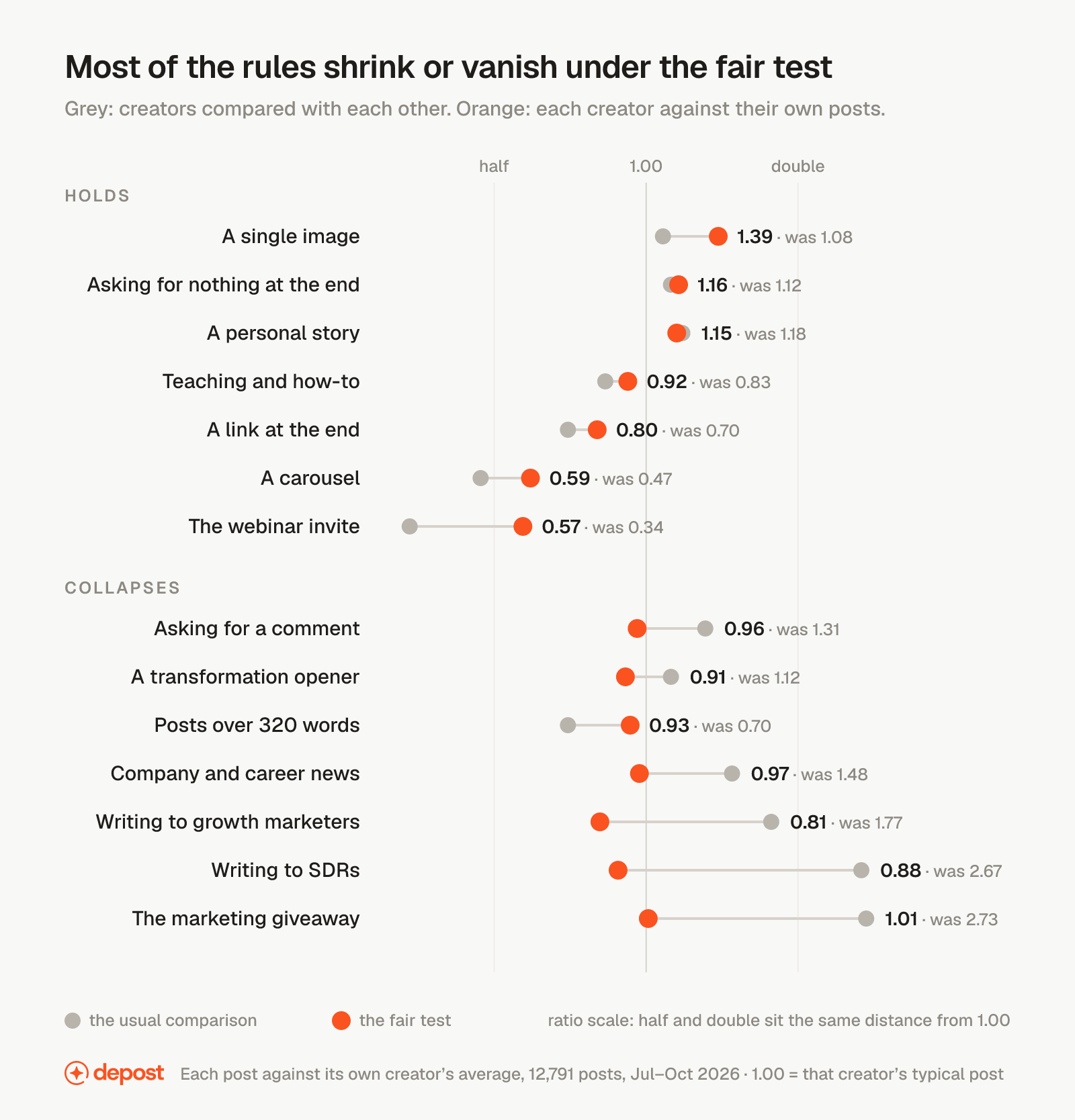
The grey dots are what you would get from the usual method on the same posts. The orange dots are the fair test. The rest of this post goes through them, then through what the post is for, how it opens, how it ends, the one format that reversed, and what changes by niche.
The seven rules that survived
None of them needs a new idea.
A single image beats the writer’s own average by 39%. 1.39, and 72% of the 222 creators who posted both with and without a picture did better with it. It is the strongest result in the data and it held in every niche.
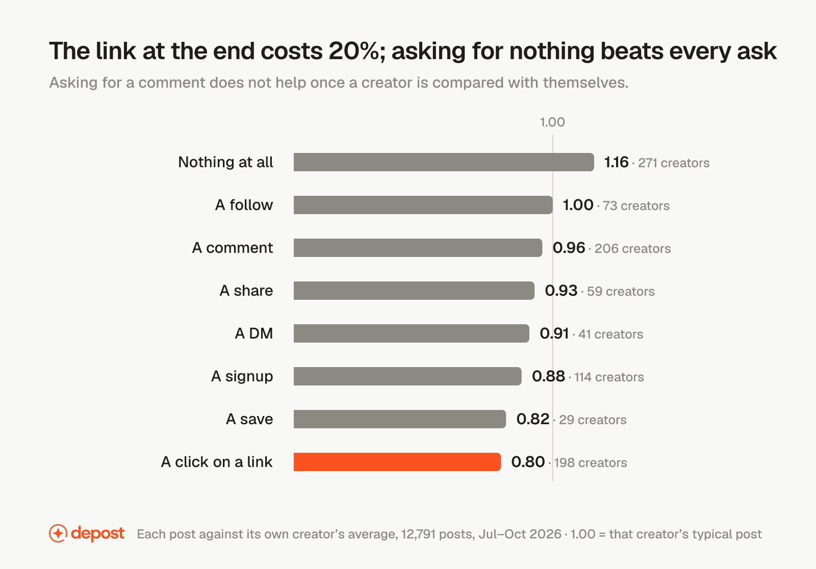
Asking for nothing beats every ask. A post that ends on its point earned 1.16 for 61% of 271 creators. A link at the end earned 0.80, and only 29% of the 198 creators who used one did better with it than without.
A personal story beats the average, and promotion falls furthest below it. 1.15 for 64% of the 276 creators who wrote one, against 0.77 for posts promoting something.
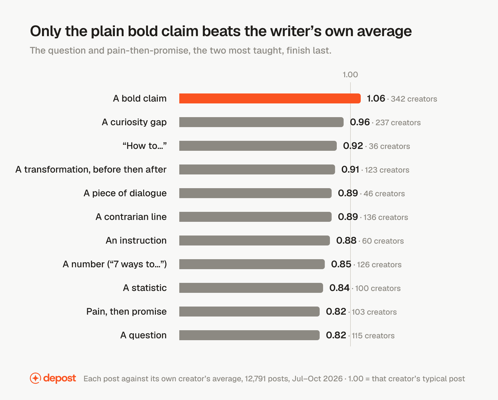
The plain bold claim is the only opener above water. 1.06 across 342 creators. The question and pain-then-promise, the two most taught openers, both earned 0.82.
Teaching is 47% of everything published and earns 0.92. Not the worst shape. The most common one, and below average for 56% of the people who write it.
Text with no picture earns 0.69. The format most people default to when they are in a hurry is the one that costs them most.
The webinar invite earns 0.60. In marketing, it beat the writer’s own average for none of the 17 creators who posted one.
The seven that collapsed
This is the part most reports leave out, because the first cut of this one had different headlines and they were wrong.
The first version compared creators with each other, per follower, against the average for their niche. That is how most LinkedIn advice is produced, and it produced numbers that looked like findings: posts written to SDRs at 2.67 times a typical post, the marketing giveaway at 2.73, company and career news at 1.48. Under the fair test those became 0.88, 1.01 and 0.97.
Asking for a comment. 1.31 in the usual comparison, 0.96 once each creator is compared with themselves. The comment ask does not lift a post. The people who ask for comments already had readers who comment. LinkedIn, for its part, now names “comment to agree” prompts as engagement bait in its description of what the feed pushes down.
Writing to a named job. The most repeated advice on the platform, and the clearest collapse. Across 121 audiences with enough posts to rank, almost every one sits within a tenth of 1.00. Posts to SDRs earned 0.88 of the writer’s own average, posts to growth marketers 0.81, posts to an AI audience 0.91. The 2.67 was a fact about who writes to SDRs, not about writing to them.
Company and career news. 1.48 in the first cut. Real number, wrong reading: senior people with warm networks post company news, and their other posts do just as well. Against themselves, 0.97.
The giveaway. 2.73 in the first cut, the highest number in it, and it belonged to 11 marketing creators. Against their own averages those 11 earned 1.01. The number was real. It was a fact about a handful of people.
The transformation opener. “I used to do X. Now I do Y.” 1.12 in the usual comparison and 0.91 in the fair one, across 123 creators.
The length rule. The first cut said posts over 320 words lose 30%. Against the writer’s own average they earn 0.93, within the noise, and no band of length moved most of the people who wrote at it. No length rule survived. Write to the point and stop, however long that takes.
Two rules, then, that looked like the strongest findings in the data were facts about who uses them. That is the whole argument for measuring against yourself.
What the post is for
Six things a post can be for. Only one of them beats the writer’s own average.
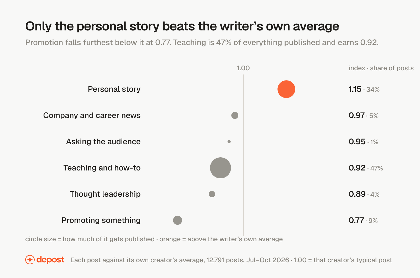
The personal story is the only goal above 1.00, at 1.15 for 64% of the 276 creators who write them, and it is a third of what gets published. Teaching is 47% of everything and earns 0.92. Promotion is 9% of posts and earns 0.77, and only 30% of the 145 creators who promoted something beat their own average doing it.
The top right of that chart, the corner for things that are published a lot and also perform, has one circle in it.
The first line
The openers taught in every LinkedIn course are the ones at the bottom of this table.
| Opening line | Against own average | Creators |
|---|---|---|
| A plain bold claim | 1.06 | 342 |
| A curiosity gap | 0.96 | 237 |
| “How to” | 0.92 | 36 |
| A transformation, before then after | 0.91 | 123 |
| A piece of dialogue | 0.89 | 46 |
| A contrarian line | 0.89 | 136 |
| An instruction | 0.88 | 60 |
| A number (“7 ways to”) | 0.85 | 126 |
| A statistic | 0.84 | 100 |
| Pain, then promise | 0.82 | 103 |
| A question | 0.82 | 115 |
Three things are worth reading out of it.
The bold claim is the only shape above 1.00, and it is also the one most creators already use. It is the safe default rather than a trick. What makes it work is that it is falsifiable: a reader can disagree with it from their own experience, and disagreement is what earns the click on “see more”.
Opening with a statistic earns 0.84. That is the data-report instinct, and it loses even for creators who have the data. A number in the first line reads as a pitch for what follows. The same finding told as a claim does better.
The question and pain-then-promise finish last, at 0.82 each, with 115 and 103 creators using them. Those two are the most taught openers on the platform. The hook generator writes alternatives from a draft, and the glossary entry on hooks covers the shapes.
The last line
The ending matters more than the opening, and in the opposite direction from what most people do.
| What the post asks for | Against own average | Creators |
|---|---|---|
| Nothing at all | 1.16 | 271 |
| A follow | 1.00 | 73 |
| A comment | 0.96 | 206 |
| A share | 0.93 | 59 |
| A DM | 0.91 | 41 |
| A signup | 0.88 | 114 |
| A save | 0.82 | 29 |
| A click on a link | 0.80 | 198 |
Ending on the point beats every ask. The link costs 20%, and on Depost AI users’ own posts it cost 18%, the one finding that held in both sets. The comment ask does not help once a creator is compared with themselves.
Where the link goes instead is a trade, and it is worth being honest about it. Moving the URL to the first comment protects the post, but a link in the comments earns fewer clicks than one in the body. If the post’s job is the click, put the link in and accept the cost. If the post’s job is the reader, end on the point.
If you change one habit from this report: delete the link, delete the question, end on the point.
The one that reversed: carousels
For the library’s top creators the carousel is the worst format. For Depost AI users measured against their own posts, it is the best.
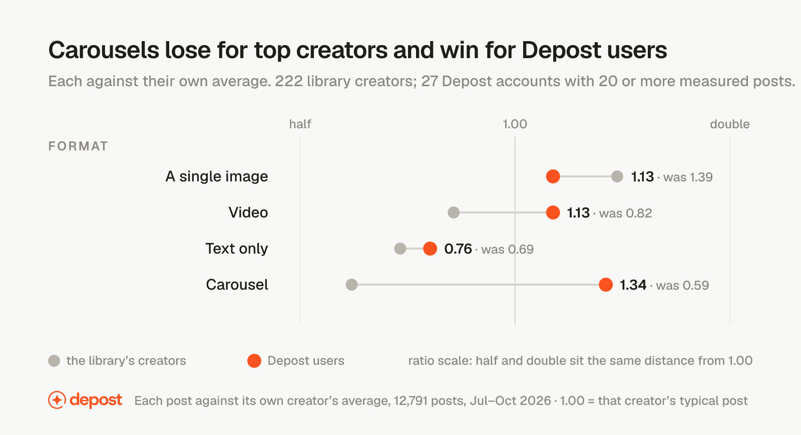
For the 222 top creators who used both, the carousel earned 0.59 of their typical post. For the 27 Depost AI accounts with twenty or more measured posts, 4,628 posts scored the same way with clicks excluded so a swipe could not count, it beat the same person’s other posts by a third, at 1.34. Video reversed too, from 0.82 to 1.13. The single image held in both sets.
The data cannot say why. Two readings fit and we are not going to pick one for you: the top creators are mostly large accounts whose text posts already travel, so a document has a higher bar to clear; the Depost AI accounts are smaller and mostly in B2B niches where a document earns the saves that carry it. Either way, the rule written for one group was wrong for the other.
This is also why the 2026 engagement-rate benchmarks put documents near the top while this test puts them at the bottom for top creators. That table measures interactions per impression on company pages. This one measures total engagement per post against the writer’s own average on personal profiles. They answer different questions and both can be right, and the practical conclusion is the same one that post reaches: your own median is the baseline that matters.
That is the case for measuring your own posts instead of borrowing someone else’s rules, and it is what the Performance Analyzer in Depost AI does. It reads your published posts against your own average and tells you which format and which shapes beat it for you, not for someone with a million followers.
What changes by niche
The general findings above held across niches. The shapes that win inside each one differ, and in two places they run opposite ways.
Marketing, sales and growth
The one niche with enough creators to test most shapes both ways.
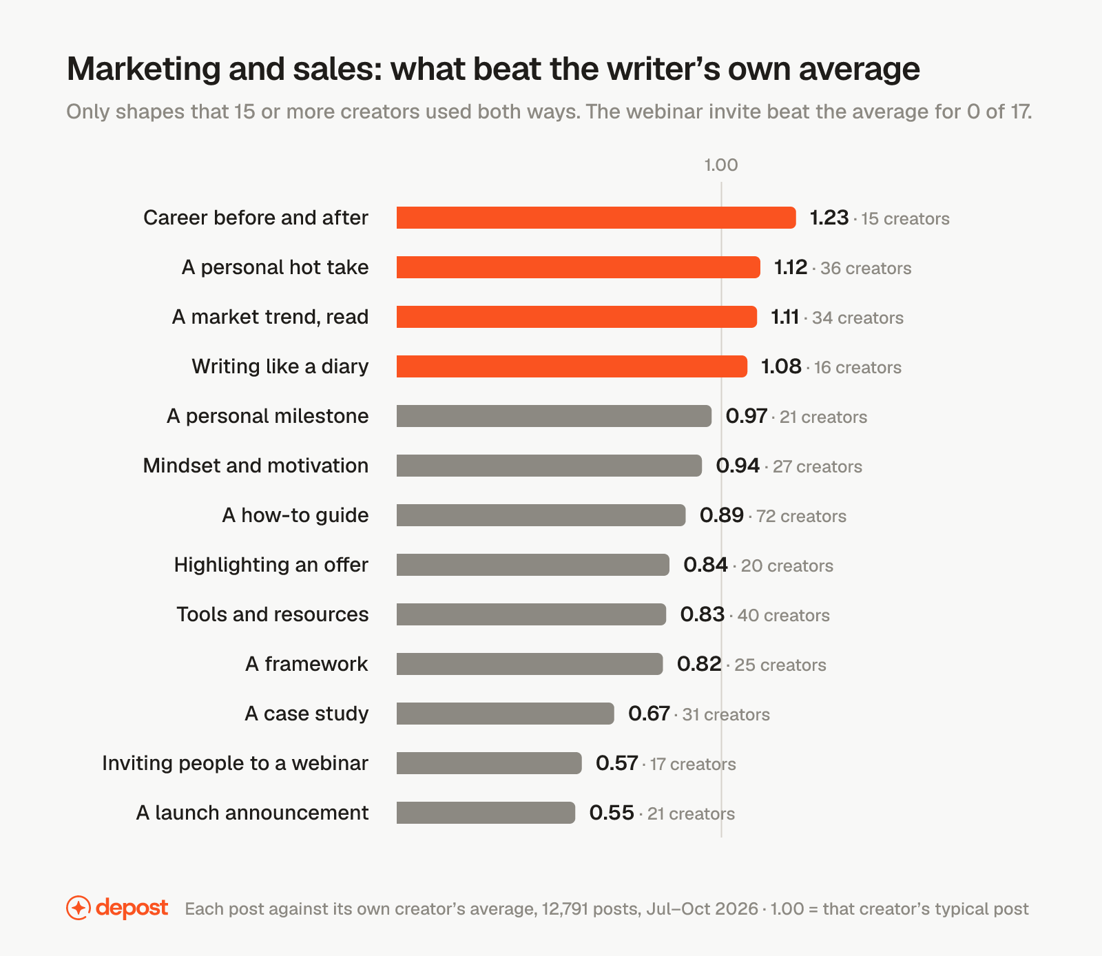
Write the before-and-after (1.23, for 73% of 15 creators), the hot take (1.12, 61% of 36) and the market read (1.11, 68% of 34). Stop the launch announcement at 0.55, the webinar invite, and the case study, the surprise here at 0.67 across 31 creators.
The giveaway, at 2.73 the highest number in the first cut, is not on this chart because only 11 marketing creators used it both ways. For them it earned 1.01.
Business and startups
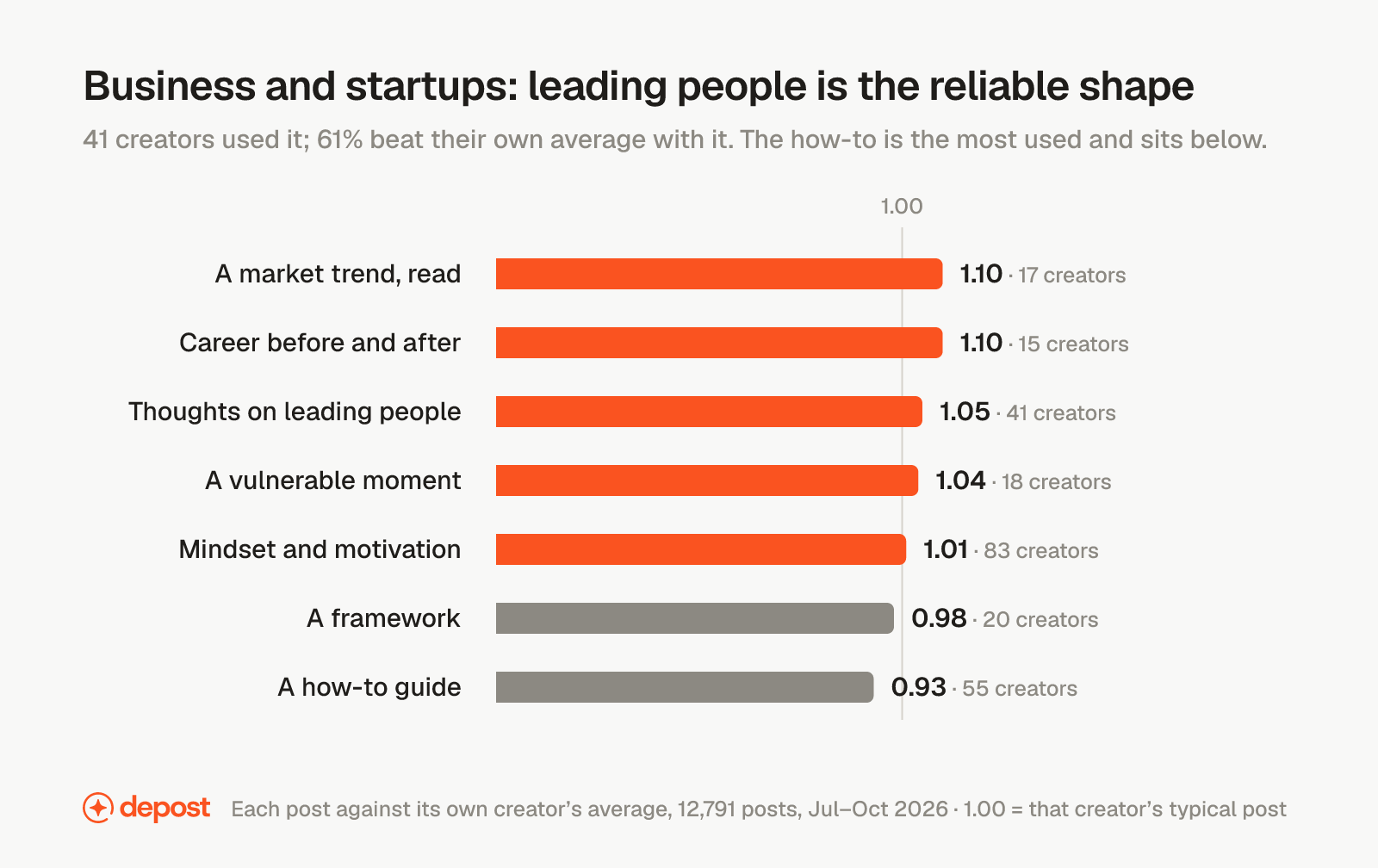
Thoughts on leading people is the reliable shape: 41 creators, 61% better with it, 1.05. The before-and-after and the market read sit at 1.10 on smaller groups. The how-to is the most used shape in the niche and sits below, at 0.93 for 55 creators. The framework, the house style of this niche, sits at 0.98 on 20 creators. The founder-lesson post did not have enough creators using it at least twice to judge, so it is not on the chart and we are not going to pretend it is.
The thinner niches
Software and product: tools and resources 1.01 on 53 creators, the how-to 0.92, frameworks 0.84, market commentary 0.83. Education and careers: nothing above 1.00 with enough creators to test. Finance: the how-to 0.98 on 15 creators. Health: the how-to 1.03 on 19, mindset posts 0.78.
In these four, the general findings are the better guide, because the niche-specific cells do not have the creators to stand on. A number from 12 creators is an anecdote with a decimal point.
How Depost AI puts these findings to work
Every finding above is a constraint, and a constraint is something a tool can be built around. Depost AI was built around these. Here is what each fact becomes inside it.
The fact: the only honest baseline is your own average. The Performance Analyzer reads your published LinkedIn posts and runs the comparison in this post on them: every post against your own typical post, so you see which shapes, openers, endings and formats beat it on your account, not on a top creator’s. It is the fair test, run on you.
The fact: the personal story is the only kind of post above average, and the how-to is half of what gets published. The Idea Generator starts from the posts that beat your own average and from its library of high-performing posts, each one labelled by shape, opener and ending. It knows what you have already posted, so it does not hand you the same angle twice, and the ideas it pitches are built on your material: a decision, a number, a before-and-after, the thing only you can say.
The fact: open with a plain claim, end on the point, keep the link out of the body. The Post Generator writes in your voice, learned from your own posts, with a first line a reader could disagree with and an ending that stops at the point. Ask it to sharpen the hook, make a draft less salesy, or name your product without opening with it, and it rewrites the draft rather than starting over. Every scheduled post goes out with its first comment already written, which is where the link lives.
The fact: one real image lifts a post by 39%, and text alone earns 0.69. The Graphic Generator designs the image for each post in your brand’s own visual identity, so nothing goes out as a wall of text.
The fact: a number that is not yours reads as a pitch. Depost AI writes around a number it does not have rather than inventing one, and the numbers it does use are the ones in your history.
And nothing publishes until you say yes. Approved posts go out through LinkedIn’s official API, with no comment automation and no engagement tools, which are the things LinkedIn names as enforcement rather than ranking.
So run the fair test on your own posts. Connect LinkedIn, and Depost AI reads your history in about a minute and shows your best and weakest posts as multiples of your own typical post, the kinds that work for you and the kinds to stop. The analysis is free and needs no card.
One honest line: the analysis is what makes the rest true. On a brand-new profile with nothing imported, Depost AI is working from the general patterns above, the same ones any model could be told. The difference starts the moment your history is in.
What this cannot tell you
These creators already post well. They are a curated set, and the direction of each finding transfers better than the multiple does. Your own baseline is lower.
Engagement is not reach, and it is not revenue. A post with 400 comments and no customers is a bad post. Nothing measured here touches pipeline.
It is correlation, not cause. A vulnerable post may do well because vulnerability works, or because the people willing to write one are better writers. The data cannot separate those. The honest version of every finding here is “posts shaped like this did better”, not “this shape will do better for you”.
Three months is one season. The window covers a northern summer and the return to work.
The shape, opener, ending and audience labels on each post were assigned by a model, not by a person, so a small share of them will be wrong. And follower counts are current rather than as at the date of each post.
What to change this week
Three moves, in the order they pay.
- Put one real picture on every post. A screenshot, a photo, a chart. The single image is the strongest result in the data, and text alone earns 0.69.
- End on the point. Delete the link, delete the closing question, delete “comment X for Y”. If a link has to go somewhere, the first comment, knowing it will earn fewer clicks there.
- Swap one how-to for one story. If half of what you post is teaching, make one of next week’s posts a decision you got wrong or a before-and-after with the numbers. The personal story is the only goal that beats the writer’s own average, and it is the one most people under-publish.
Then measure your own. Twenty posts, each divided by your median, and look at which ones cleared it. That table says more about your readers than this one does. The post analyzer grades a single draft against a fixed rubric before it goes out; the Performance Analyzer in Depost AI runs the comparison above on your whole history.
FAQ
What type of LinkedIn post gets the most engagement in 2026?
Measured against each writer’s own average across 12,791 posts, the personal story is the only post goal above 1.00, at 1.15 for 64% of the 276 creators who wrote one. A single image lifts a post by 39%, ending with no ask earns 1.16, and the plain bold claim is the only opener above average. Promotion earns 0.77 and the webinar invite 0.60.
Do carousels still work on LinkedIn in 2026?
It depends on whose posts you measure. For the top creators in this test the carousel was the worst format at 0.59 of their typical post. For Depost AI users measured against their own posts it was the best, at 1.34. Engagement-rate benchmarks for company pages also put documents near the top. The only reliable answer is to run the comparison on your own last twenty posts.
Does a link in a LinkedIn post hurt reach?
In this test a post that ends by asking for a click earned 0.80 of the writer’s typical post, and only 29% of the 198 creators who used one did better with it. On Depost AI users’ own posts the link cost 18%. LinkedIn has never confirmed a link penalty; what the data shows is that link posts earn fewer of the actions that count. Moving the link to the first comment protects the post but earns fewer clicks.
Should you end a LinkedIn post with a question?
Not if the goal is engagement. Ending with no ask at all earned 1.16 for 61% of 271 creators, while asking for a comment earned 0.96 once each creator was compared with themselves. Opening with a question also finished last among openers at 0.82.
How long should a LinkedIn post be?
No length rule survived the fair test. Posts over 320 words earned 0.93 of the writer’s own average, which is within the noise, and no band of length moved most of the people who wrote at it. Write to the point and stop, however long that takes.
Does niching your LinkedIn audience work?
Not in this data. Across 121 audiences with enough posts to rank, almost every one sat within a tenth of 1.00 of the writer’s own average. Posts to SDRs earned 0.88, posts to growth marketers 0.81. The high numbers for named jobs in the usual comparison were facts about who writes to those jobs, not about writing to them.
What is the best hook for a LinkedIn post in 2026?
A plain bold claim, at 1.06 across 342 creators, the only opening line that beat the writer’s own average. A curiosity gap sat at 0.96, a transformation line at 0.91, a statistic at 0.84, and the question and pain-then-promise, the two most taught, at 0.82 each.
How was this measured?
12,791 LinkedIn posts published between 9 July and 6 October 2026 by 655 creators, drawn from a library of 141,170 posts. Each post’s engagement (reactions, comments and reposts) was divided by the same creator’s average over the three months, so 1.00 is that creator’s typical post. A rule’s score is the median across creators who used the shape at least twice and did something else at least twice, with the share of those creators who beat their own average beside it. No cell rests on fewer than 15 creators. Depost AI users were 27 accounts with twenty or more measured posts, 4,628 posts, scored the same way with clicks excluded.